Yet another year is coming to a close and we’re feeling pretty sentimental. Looking back on the year, we’ve been involved in some amazing projects big and small. We’d love to tell you about them all, but we’d need a lot of coffee to get us through the long list of our client’s achievements, so we’ve picked a handful of different projects to properly celebrate their journey’s through 2022!
The Mistletoe and Fine Curtain Company
Let’s make way like any good Christmas and start with the present. The Fine Curtain Company are already seeing a huge amount of success with their very festive Christmas social ad campaign! This ad is already putting the star a-top the tree, running at a whopping 1.85% clickthrough rate! That’s pretty darn good if we do say so ourselves (well done Char)! Just to put it into context, when running a social ad a good target would be to work towards a 0.5% clickthrough rate. So, you could say, we’ve sleighed that one.
We’re also in love with the design for the ad, which is courtesy of our very own studio assistant stroke illustrator Jess. It’s classy, it’s christmassy, it’s curtains.
(Barely) Pay Per Click
The success of our Google Ads can sometimes get lost amongst the grandeur of website builds and design work, but we couldn’t talk about this year’s highlights without mentioning the astronomical growth of Norfolk Yacht Agency’s PPC account. We have been working hard and conversions have increased by 585.4% (yeah, wow) and the cost per click is at an all time low at just 6p! Now that’s boat-iful!
A social media transformation
It’s been a year of hard graft and graphic creation for GCB Recruitment’s social media, and on reflection it’s really paid off. An evolution on their old styling makes for an extremely modern and satisfying social feed and when you put it next to their old one, side by side, the difference is really quite something. Simply by using a deeper shade of blue as their main brand colour, and by using a more stylized feature of their iconic fractured GCB logo, we have managed to achieve a new and consistent level of sophistication without losing the element of fun and personality that makes GCB as a company so special.
Time has flown… and so have Michlmayr’s rankings
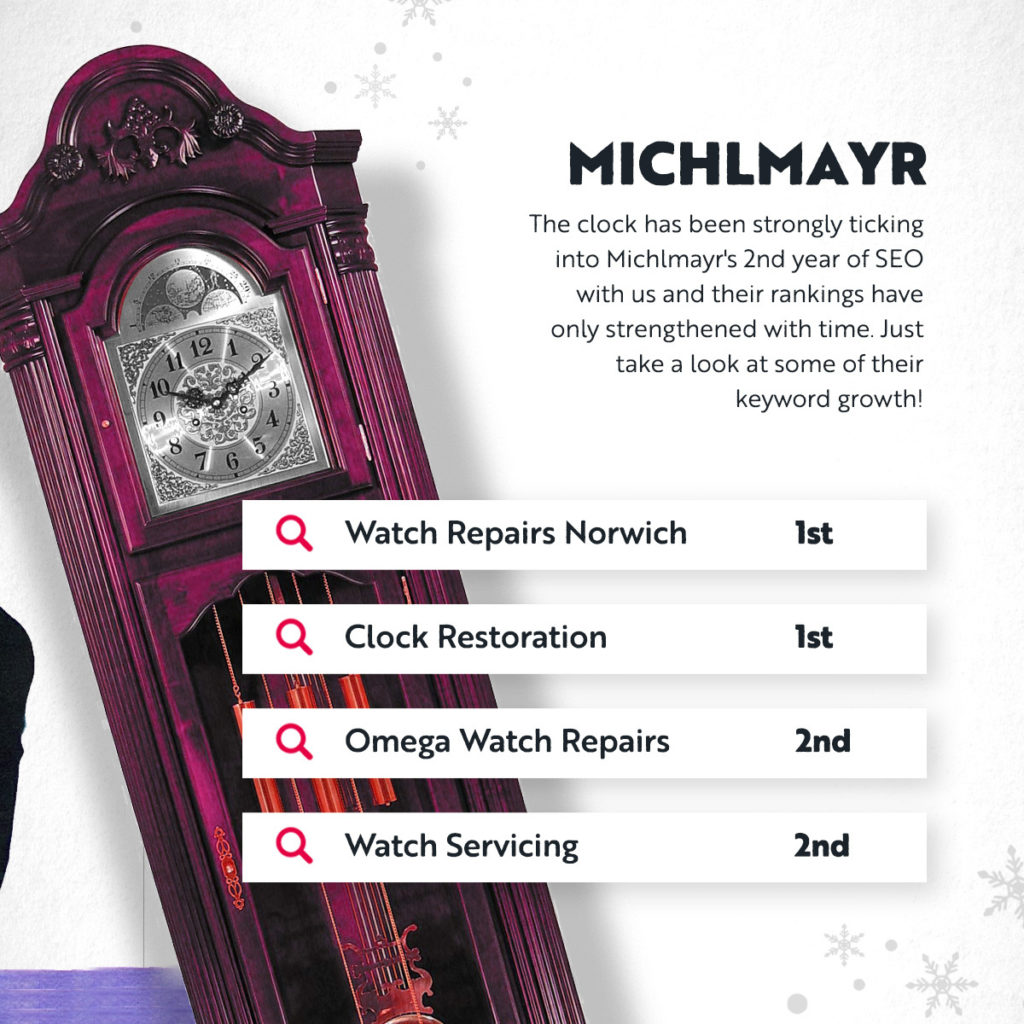
Earlier this year we went live with a website redesign for clock and watchmakers Michlmayr who will be ticking into their second year of SEO with us as we wind into 2023. We aimed to bring a touch of modernity to their new site, while maintaining the class and luxury of their brand. These guys are accredited Rolex watchmakers, they are the epitome of precision, perfection and opulence, so of course, they needed a website to match! (No pressure.)
But the website isn’t just a pretty face. With the new site came new brand landing pages for the likes of Tag Heuer, Omega, and Rolex to name a few, which we optimised fully to focus on those all important brand specific search terms. Ellie’s energy has been reflected in some great results as you can see below. All brand keywords have gone from not ranking at all, to ranking on the first 2 pages of Google in less than a year!

P.S. We’ve also remained in first place all year for ‘watch repairs norwich’… Just say’in.
First glass social
Our clients’ happiness is what feeds our creativity, and our retention rate is one of the things that proves to us that we’re doing alright, and the work we do is truly making a difference. One of our long retained clients is James Neil, founder of Norwich Glass and City Locks. James has been a member of the Nu Image clan for over 5 years now and we are particularly proud of the improvements we’ve made to his social media presence. A little polish here and there et voila! A fresh and crisp social feed. Squeaky clean. Take a look at the before and after shots below:
Speed of light SEO for our favourite social workers
Thornton & Lee (or as we call them, Becs and Faye) are two registered social workers who specialise in Mental health capacity assessments. When T&L came to us with an existing site, despite offering a very important and expert service, they were not quite ranking in Google SERPs. Since being with us for just under a year now Phoebe has been working hard and now they’re on top of the world and on the top half of the first page for a handful of their keywords. We love to see it!
As a result of these quality rankings we have increased organic traffic to the site by 300% compared to last October! The stats don’t lie, take a look below:
Now that’s some speedy SEO… If that’s how well we did in year one, we can’t even imagine where we could get them to in year 2. Watch this space.
Our new besti, Zesti
Let us tell you about Zesti. Zesti is a sustainable scrub uniform company, a dead funky one at that! And, until January 2021, they didn’t even exist! We were lucky enough to be given the skeleton of a brand and were trusted to flesh it out until it became a fully fledged, functioning and fabulous entity packed with personality and potential to thrive in the market. Between us, with brand consultancy from our Director, Ian, a solid social media and influencer marketing strategy from our Social Exec, Char, a digital marketing plan driven by Account Handler, Phoebe, and clever developments form our designer, Stephen, we’ve curated an exciting new brand on the block that has really grown wings.
We have helped develop a young, and socially conscious tone of voice that has strengthened Zesti’s brand identity across not only the site and their social platforms, but in the wider healthcare community. It’s been a real journey, and we’re really proud to have played such a big part in their story.
Since we launched in January we have increased revenue by 355%! Creating a whole new brand identity is no walk in the park and we are proud of how we’ve put our heads together to build a strong personality and voice.
Big brand changes for BRSCC
We were more than happy to take on this beast. We took on a brief from the British Racing and Sports Car Clubs (known as BRSCC). When they came to us, they were entering a new era, a new phase of racing and needed to update their entire branding in line with the new advancements. As one of the most prominent and recognised motorsport event organisers in the UK, The BRSCC needed to retain enough of their old look as to not upset their loyal current members, but evolve it enough in line with their new goals and a newer audience.
SO the challenge was to nod to their past whilst leaning into the future… All drivers racing are supposed to have the BRSCC logo on their car, which unfortunately the old logo wasn’t geared up for. The logo’s text was too small to read, making it hard to identify the brand. This year we saw nearly every car sporting the fresh logo we designed, a massive increase compared to previous years! Also we thought it worth mentioning that BRSCC were recently featured on TopGear ( ?), during the clip you could clearly see the BRSCC flags on the track with the new logo, something we worked very hard on achieving when working on the initial design.
Did someone say Vogue magazine?!
Yep, we did! One of our clients has featured in this month’s edition of Vogue, so of course, we’re feeling mad proud and probably won’t shut up about it for a while! A huge congratulations to DOXI. Cocktails. A recognition well deserved and a job well done!
According to Vogue, they make the ‘perfect gift for any cocktail lover.’ And of course, we couldn’t agree more.
So where do we come in? We had the pleasure of designing and building DOXI’s new website this year, featuring beautiful imagery of their delicious, handmade cocktails. We kept the look clean, minimalistic, and let the carefully handmade cocktails and fresh ingredients speak for themselves. The bottles are gorgeous and really made the site what it is, and that’s on DOXI, not us.
Saving the best till last. (Only joking)
This year, despite the big office move and taking on a whole load of new exciting clients, we’ve actually had some time to work on ourselves. (Yeah, we don’t know how we’ve done it either.) No expenses spared, we thought it was about time we gave ourselves a makeover of our own, and we really went for it! We built ourselves a new animated website packed with Nu Image flair paired with a shhhexy rebrand.Have you seen our new logo yet? We got our creative minds together to turn the N and I in Nu Image into something as unique as we are… and that’s not all! Keep tuned for a little website makeover, coming very soon.

Social Media Management