Nothing beats good sax.
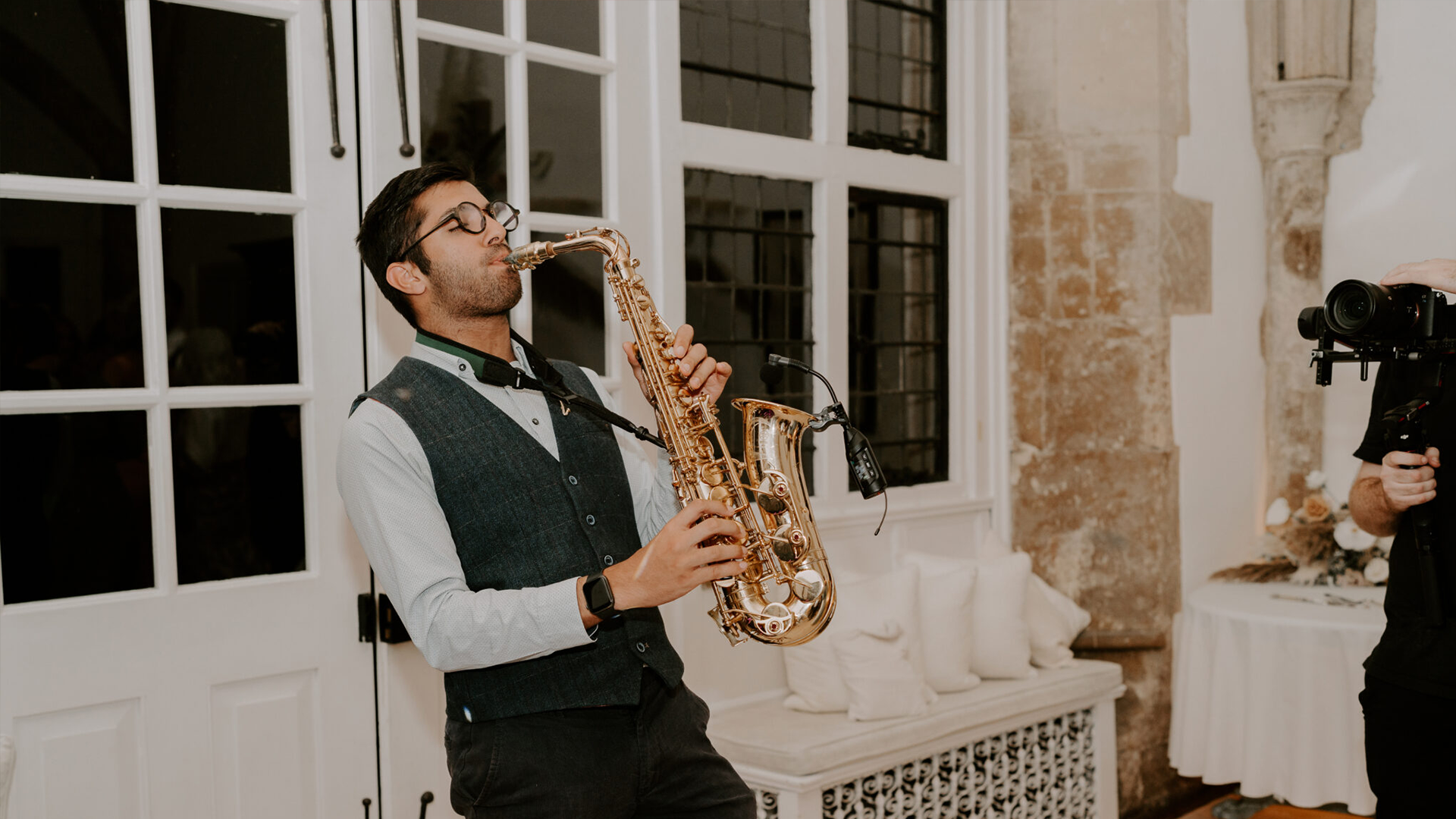
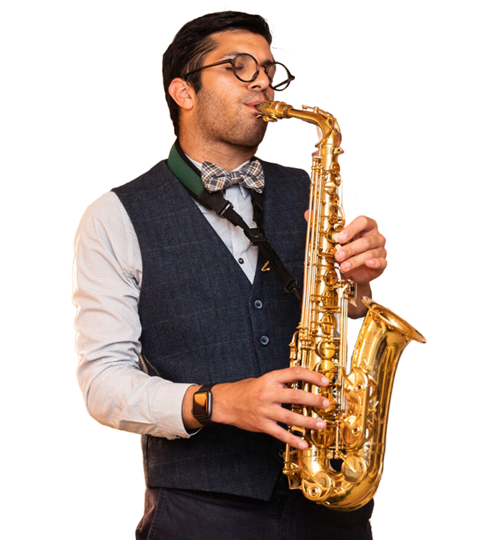
There is no instrument like the saxophone. With its bold yet seductive sound, this beautiful piece of brass is a win for weddings and functions, perfect for providing smooth background music or getting everyone onto the dance floor.
Alex, an expert saxophonist struggling with his enquiries (and our social media exec extraordinaire here at Nu Image), turned to us for a whole new website. He could see the work we do for our other clients and wanted a piece of that action!
It was time to sound the horns. Our team got started designing and building a site that would allow Alex to keep the good tunes coming.
The goal
So, what did Alex need?
His priority was ensuring his clients had a clean user experience when placing an enquiry and that Alex got all the information he needed off the bat. His old website left him chasing after potential clients, asking about locations and dates and set lists back and forth, which often took a while and made juggling both his jobs tricky.
Beyond increased functionality, Alex was looking for something to solidify his brand. He hoped a new website would create some authority and trust, helping grow his reputation and upping the chance of returning customers.
What we did
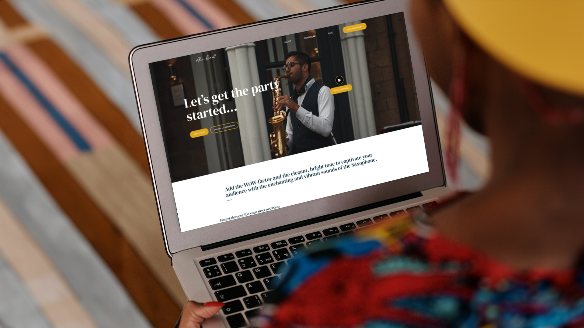
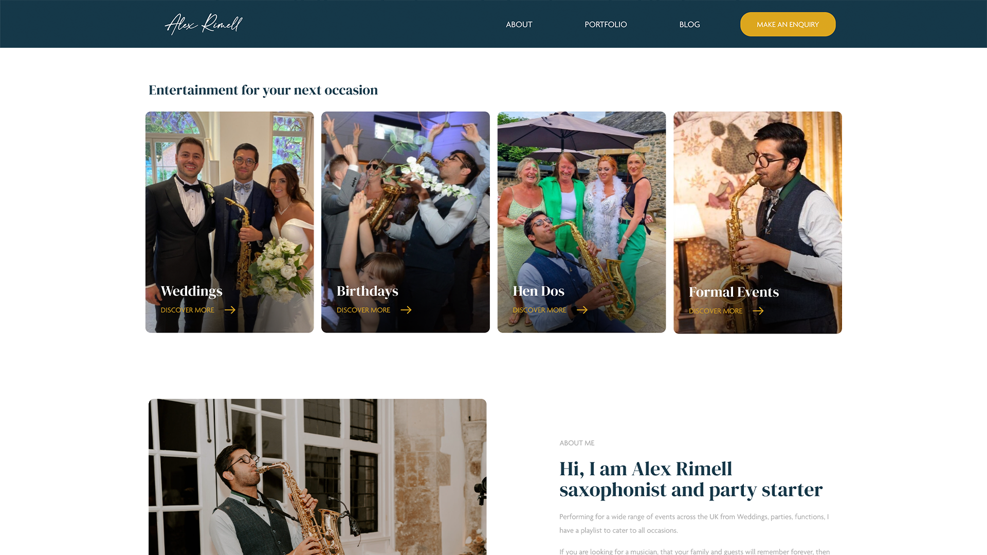
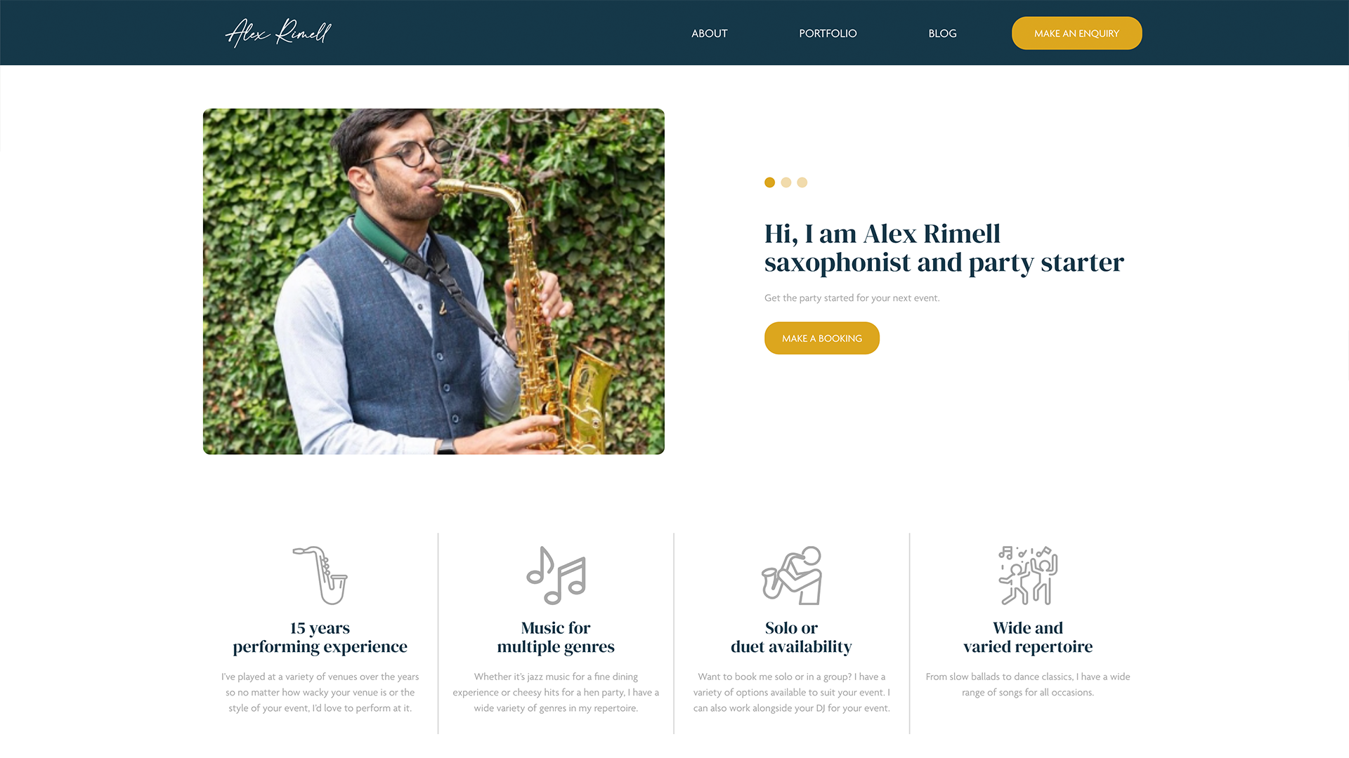
To start, designer Stephen chose some brand colours for Alex, which are used throughout the site and Alex can use in his social media graphics. He chose a deep blue, the same colour as the waistcoat Alex always wears to perform, and a punchy gold for the highlights and calls to action, influenced by the gold of a saxophone. Ensuring the call to action draws the eye is crucial to any site design, as this points visitors towards the conversion, which in this instance was the new enquiry form to make Alex’s life easier.
Video was extensively used throughout to give the site the same level of energy that Alex gives to his events and clients. The experience of having Alex perform needed to be mirrored in the design choices, so choosing video allows for movement. Photos simply don’t do Alex and his work justice.
One of our star developers, Rebecca, handled this build. She started the process by discussing the design with Stephen to get a better feel for the site. Rebecca then blocked and mapped it, customised the basic site skeleton, and began to build.
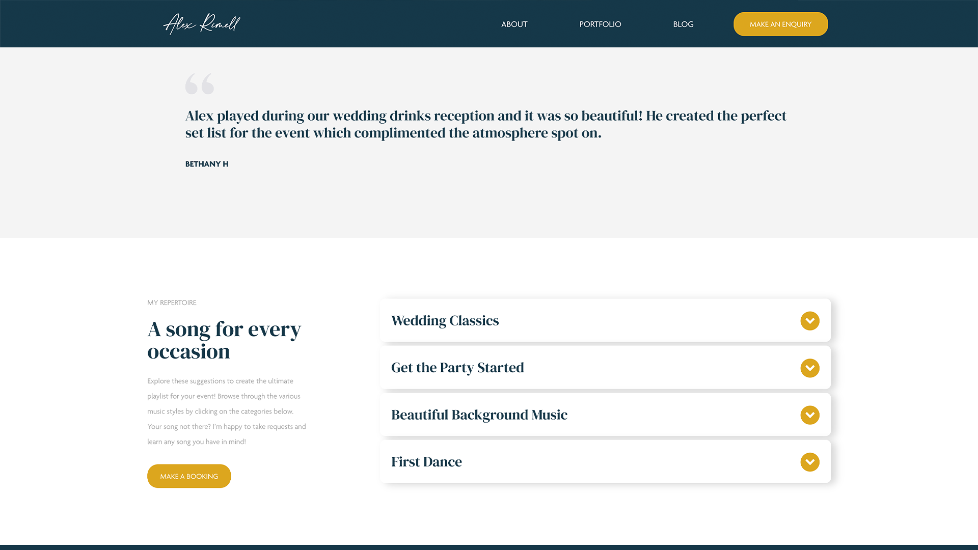
To improve the user experience, Rebecca created a contact form that asks for specific information from the client so that Alex can have all the information he needs from the get go. This reduces the amount of back-and-forth and saves Alex a lot of time working out what all his clients need.
For instant character, Rebecca added a video banner to the top of the homepage to welcome visitors and introduce them to Alex. This video immediately catches attention, creating a hook that potential clients are drawn to. We wanted to show them what Alex can do before they’ve even navigated through the site for more information.
The resources page was added so that Alex has space to upload blog posts, updates and the all-important portfolio pieces about his past events. This provides potential clients with evidence of Alex’s amazing work, helping solidify their decision to enquire.


A huge thanks to the whole team at Nu Image for all their work building my website. From talking with Ian about my site ideas from the start and his vision for it, I knew that Rebecca would do an incredible job at creating the site for me. Ben was very communicative about all the updates and progress of the site. I’m thrilled that since it’s launched, enquiry requests have increased, and so many clients have complimented my site.
The outcome
Drumroll (or saxophone honks), please… Alex’s sax site is a success. The design and build have resulted in a gorgeous website for a serious saxophonist, and Alex is already seeing several positive repercussions.
His enquiries now come through with all the information he needs, so he’s no longer spending his free time chasing after clients. He’s able to immediately organise his enquiries, making his life a lot easier (you’re welcome, buddy). Alex has also made use of his blog page, uploading case studies to impress potential clients.
And wowed they are. Alex has seen an incredible increase in enquiries since his new site launched, including seeing conversions coming from the blog page. Within four months of being live, compared to the previous four months of his old site, conversions have gone up from 10 to 88. Direct traffic has increased from 271 to 1046 visitors, and time spent on the site has grown from an average of 36 seconds per session to a whopping 2 minutes and 2 seconds. And that’s all before starting digital marketing.
These numbers, combined with Alex’s satisfaction with the results, show just what a new, fresh website can do for your business and your brand’s reputation. The positive feedback from his clients has been overwhelming, which we’re taking as a personal win, too.
One of Alex’s great hopes was that people visiting his site wouldn’t just be booking a saxophonist for a one-off event. He hoped that, by increasing his online reputation, he could become a client’s resident saxophonist and be booked for their future events. From the look of his enquiry book and reviews, we’ve helped him do just that.
Related Projects

Want to make music together?
If you’re looking to showcase your brand and build your business, it might be time for a new website to support your goals. Get in touch today and let’s get started.