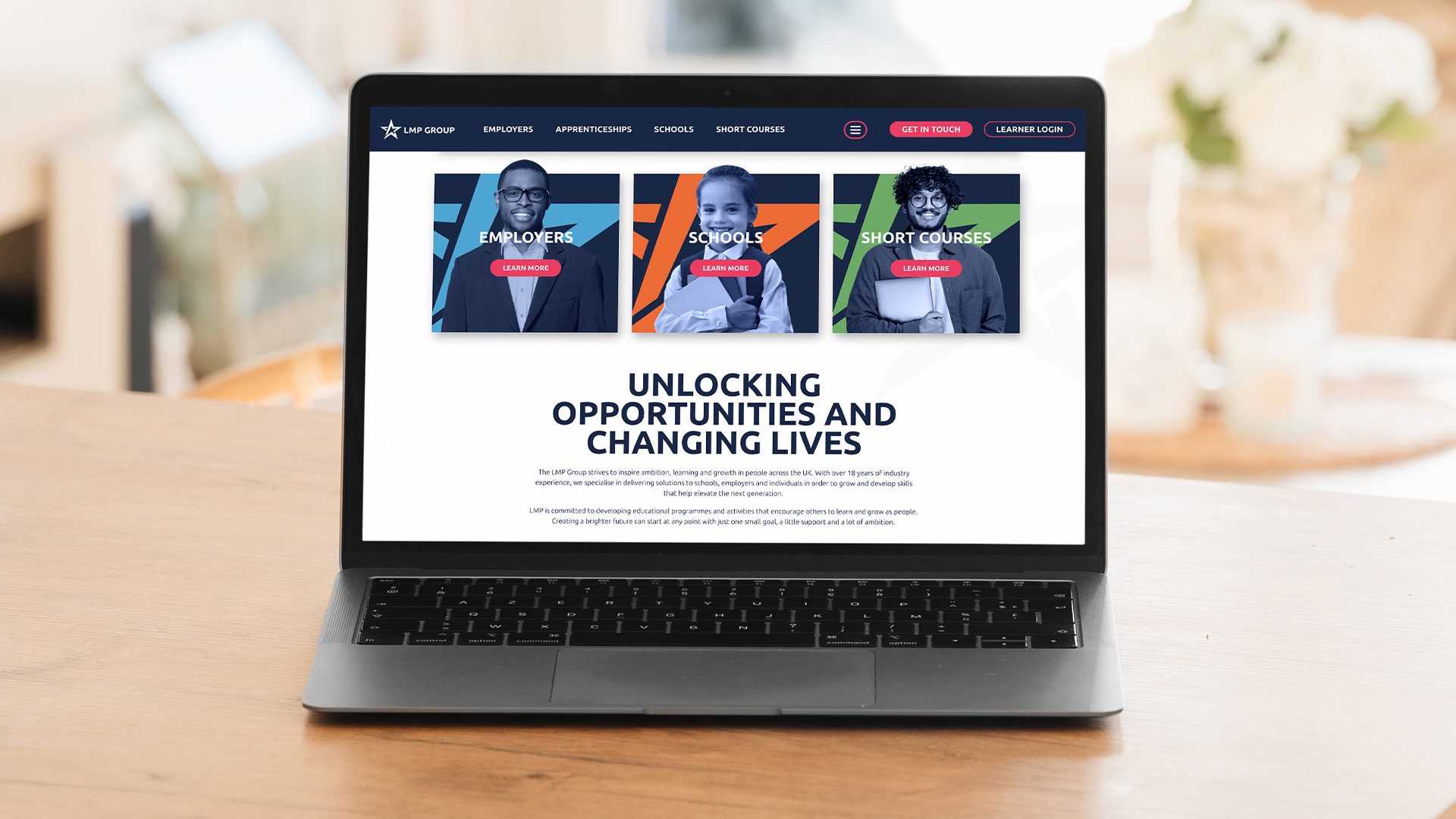
It was around the middle of last year when we first touched base with LMP Group. They reached out with an aim to update their existing website which they felt limited them in terms of usability, or as we industry buffs call it, user experience (UX).
The job at hand
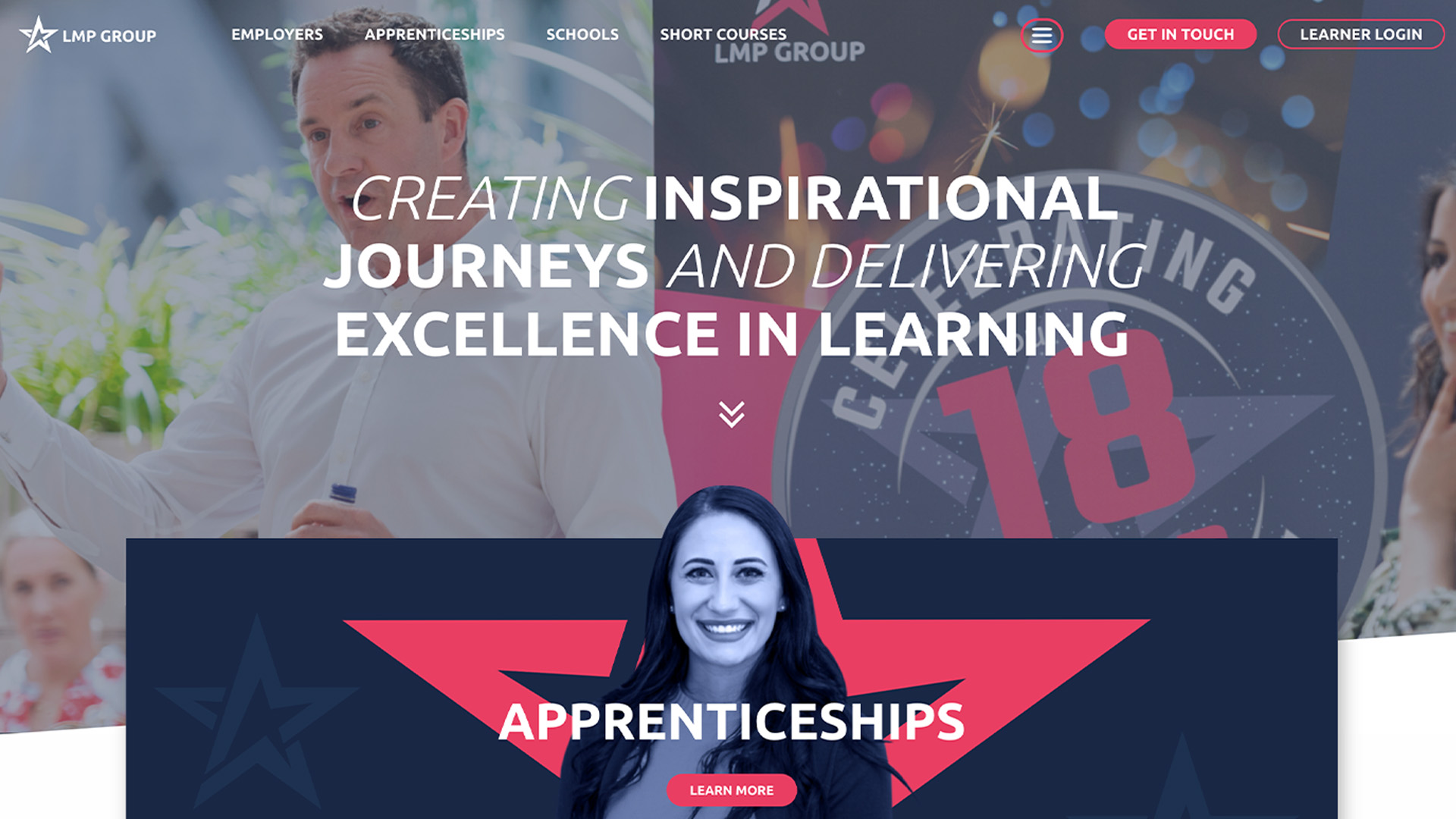
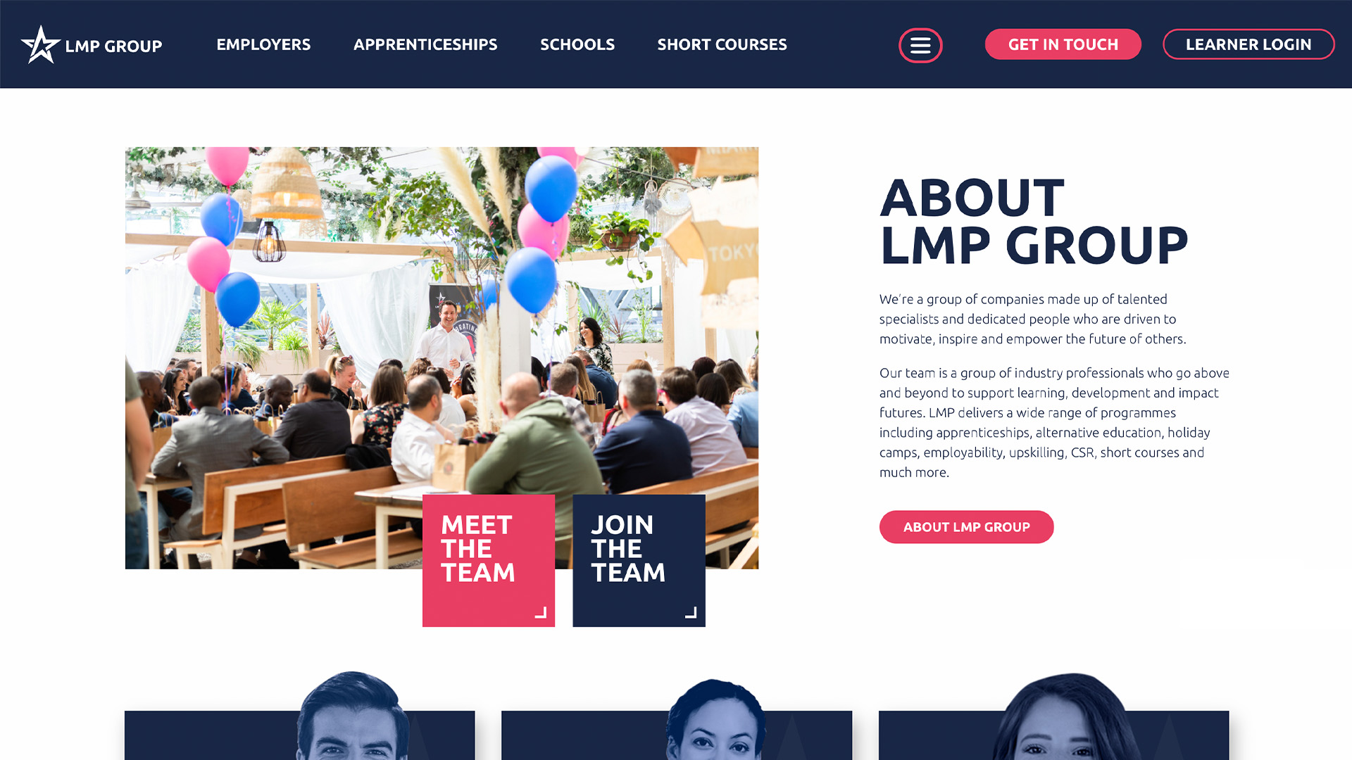
Just before LMP came on board for a build with us, they had some new branding drawn up. And it was punchy! Strong brand colours and confident shapes that we couldn’t wait to play with. Part of our task was to roll out the new style and bring their website up to date, in line with their snazzy new brading.
Another key requirement, which we briefly mentioned above, was the need to restructure their wide array of offerings to ensure users experienced a slick user journey and thus, more likely to convert. Whilst apprenticeships are LMP’s bread and butter, there were other key services that we needed to present clearly too. The other layer to consider was that within those key services, there were various industries. Without mapping out a clever navigation system, it could easily have become overwhelming for a user, especially when there can be some crossover between the key services. We didn’t want anyone tying themselves in knots trying to find what they needed.
Putting our money where our mouth is
A great way to lead a user through a complex website? Colour. LMP’s new brand colours served to create a paving system, to walk the user through the site with clear sign posts.
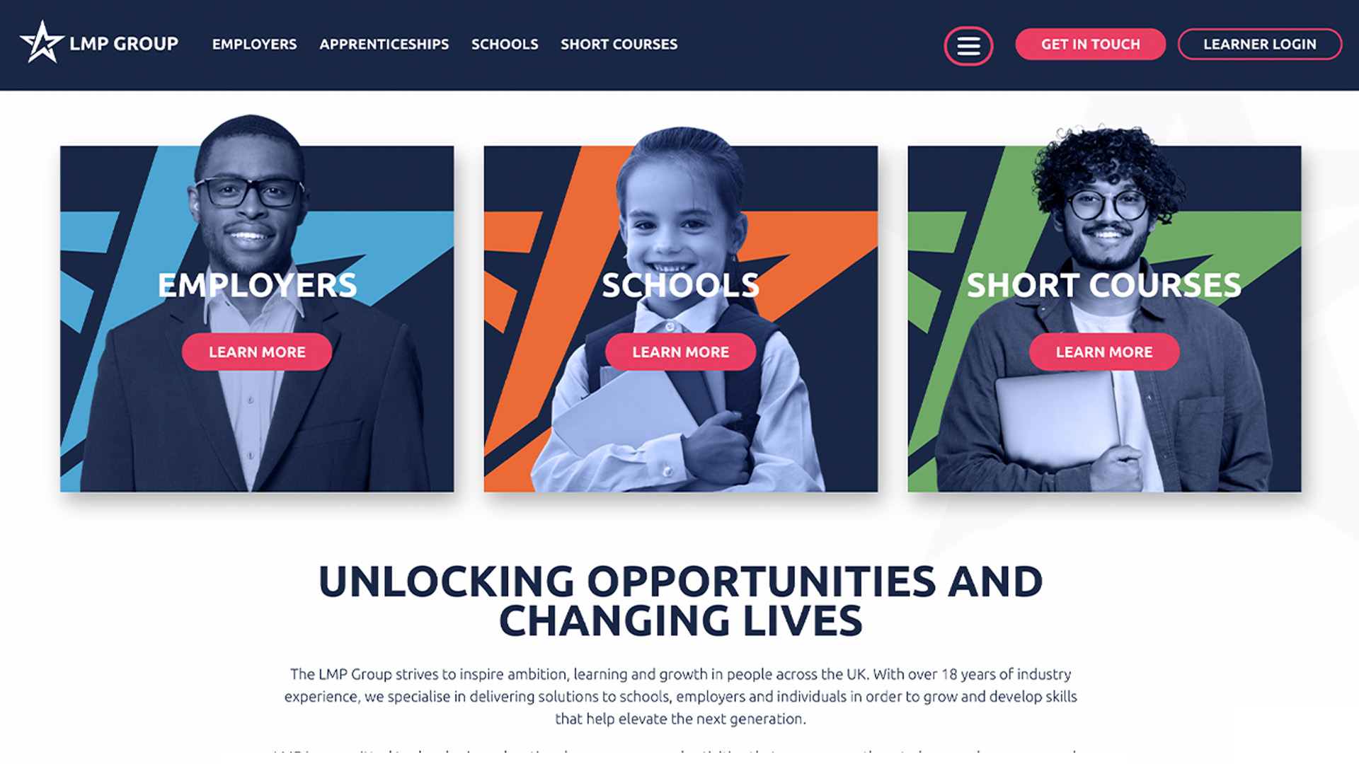
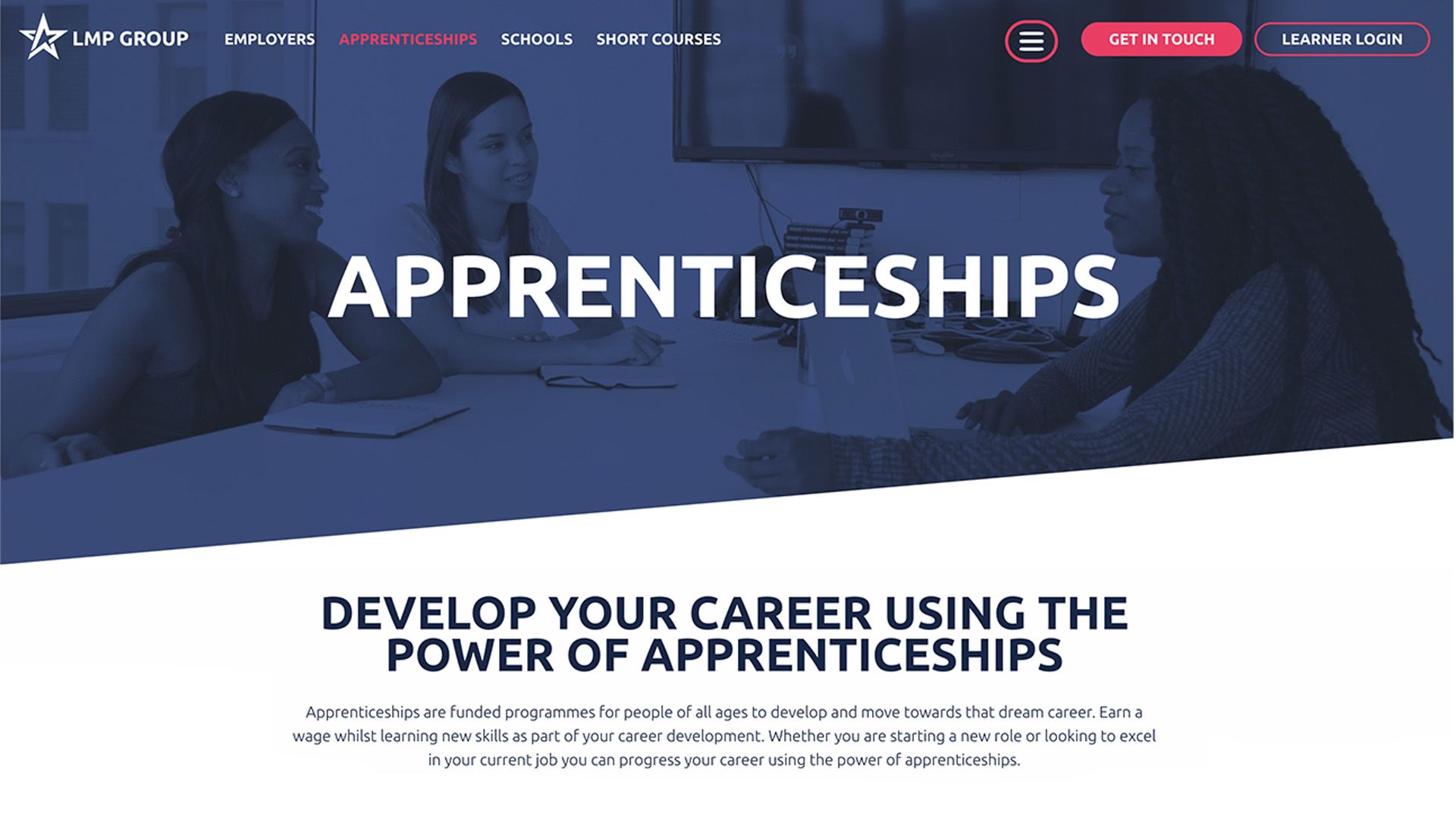
We segmented the site into 4 main user journeys; Apprenticeships, Employers, Schools and Short Courses. When the user navigates to an Employer page all clickable elements turn into their branded blue. Schools turn orange. Short Courses flag up green. And all Apprenticeship services are pink.
Whilst these are all standalone services, there are certain areas where they overlap; for example, some employers might be looking to upskill their current staff or hire an apprentice. To account for this, we added a parameter which meant that if you navigate to an apprenticeship related page from Employers, the main call to action colour would remain the colour it was on Employers. This meant that we could provide a clear separation between each sector and user journey, but adapted it so it would facilitate any crossover.
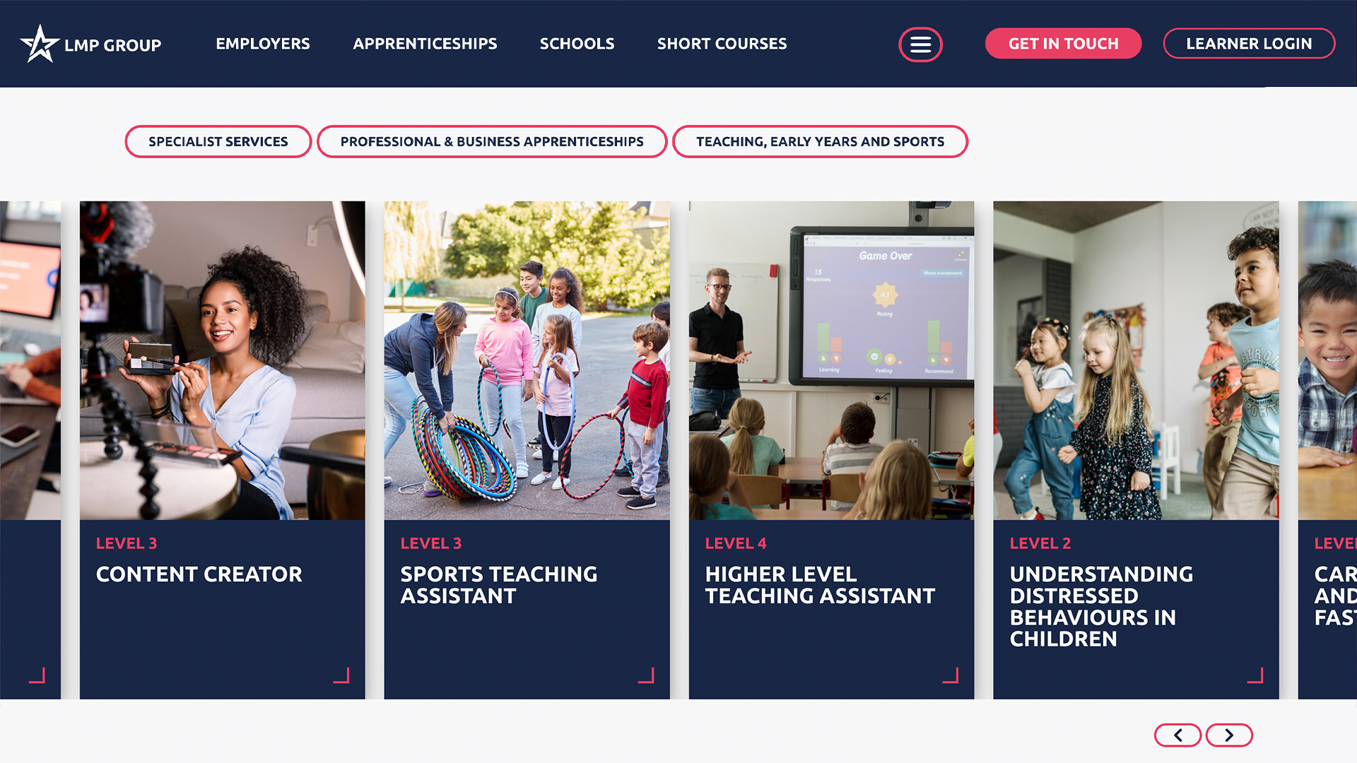
We also introduced a split navigation which meant the core services remain visible at all times. Secondary information is hidden behind the burger menu for tidiness. In doing so, we provided a clear hierarchy and made sure we don’t fluster anyone with too much information all at once! We also introduced filters to the course pages so users can feel more in control of what they’re seeing. They only need to digest the information they’re actually interested in.
When it came to images, we added cut-outs throughout the website to break away from that generic block-based format. This gave the site a more eye-catching, dynamic and fun design. LMP stands for Let Me Play afterall!
We needed to engage a variety of audiences so we had to get the balance correct between eye-catching yet informative. We introduced ways of breaking up the text and different ways of formatting key statistics and information to ensure the core messaging was prominent throughout the site.
Related Projects

Got a problem you need solving?
When it comes to websites with a high volume of information, niche requirements and bespoke functionality, we certainly love finding a solution. Call it cathartic, or call us mad, it’s up to you! But, this project was so fun to work on and really engaged every department in overcoming any obstacles and creatively thinking outside of the box.
Do you have a large site that needs re-organising? Are you worried your users are getting confused and not sure what you’re offering? Give us a call, we’re confident we can help.
Catch us on 01603 859007 or chuck us an email on hello@nuimage.co.uk.

