Time for the next step
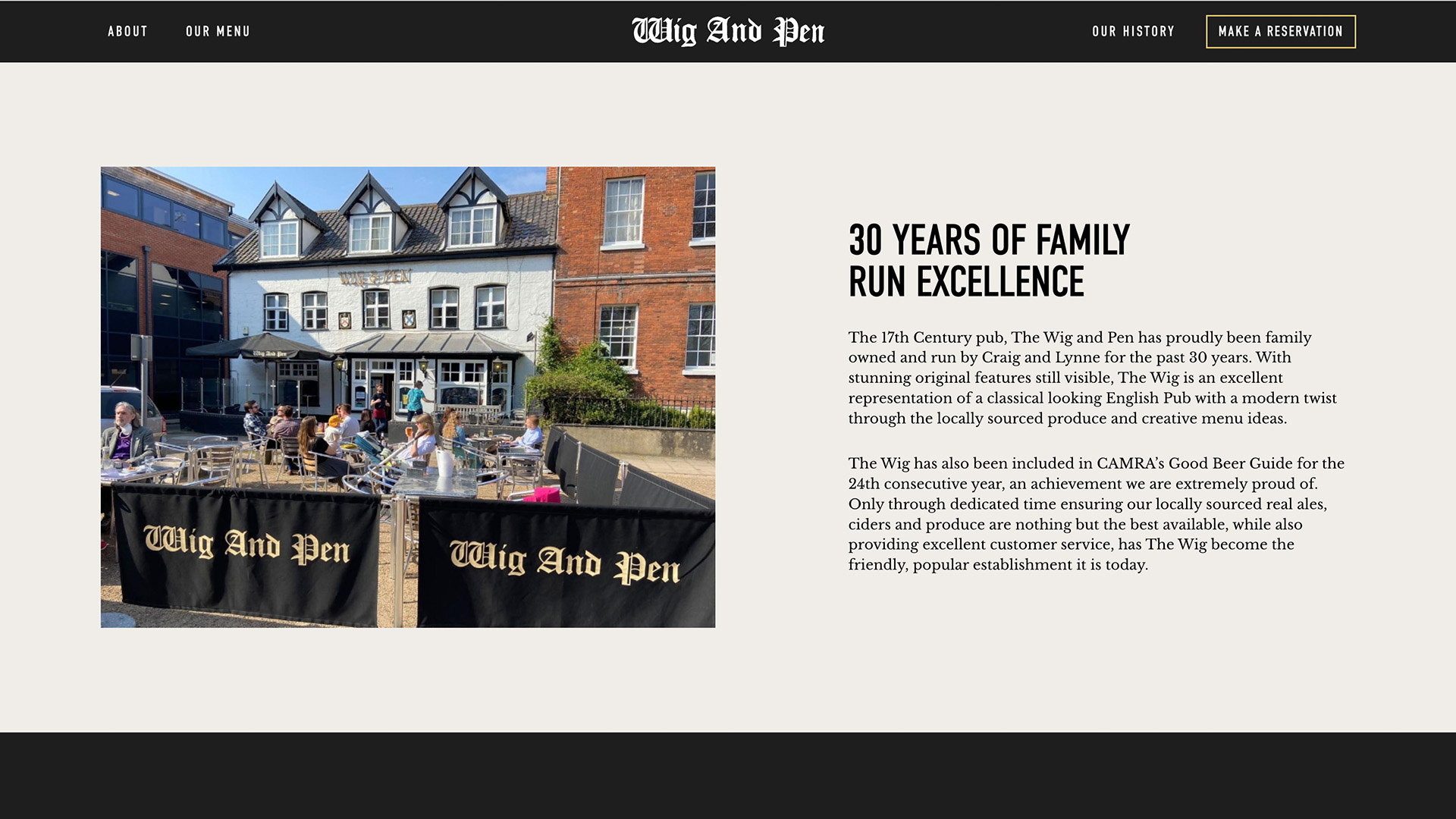
The hospitality industry certainly brings its own challenges, and after 30 years of successfully running the Wig and Pen in Norwich, owners Craig and Lynne have certainly seen a fair few changes of their own.
For many years now, the pub (fondly referred to as the Wig) based in the City Centre, has done a roaring trade. Experts in refreshing professionals during their lunches and meetings, gearing up the Norwich fans with hearty pre-match breakfasts and serving the locals with their array of real ales and good old fashioned values.
However, these guys haven’t been able to continue through the years by simply standing still, like all longstanding independents they know that strength comes from adapting to the times. Currently undergoing an interior refresh, it seemed like a fitting time to also approach an online renovation too.
THE GOAL
When they came to us, the guys knew that the time had come to evolve their online offering and accessibility. The Wig’s website wasn’t fully functioning and there was no way to book online.
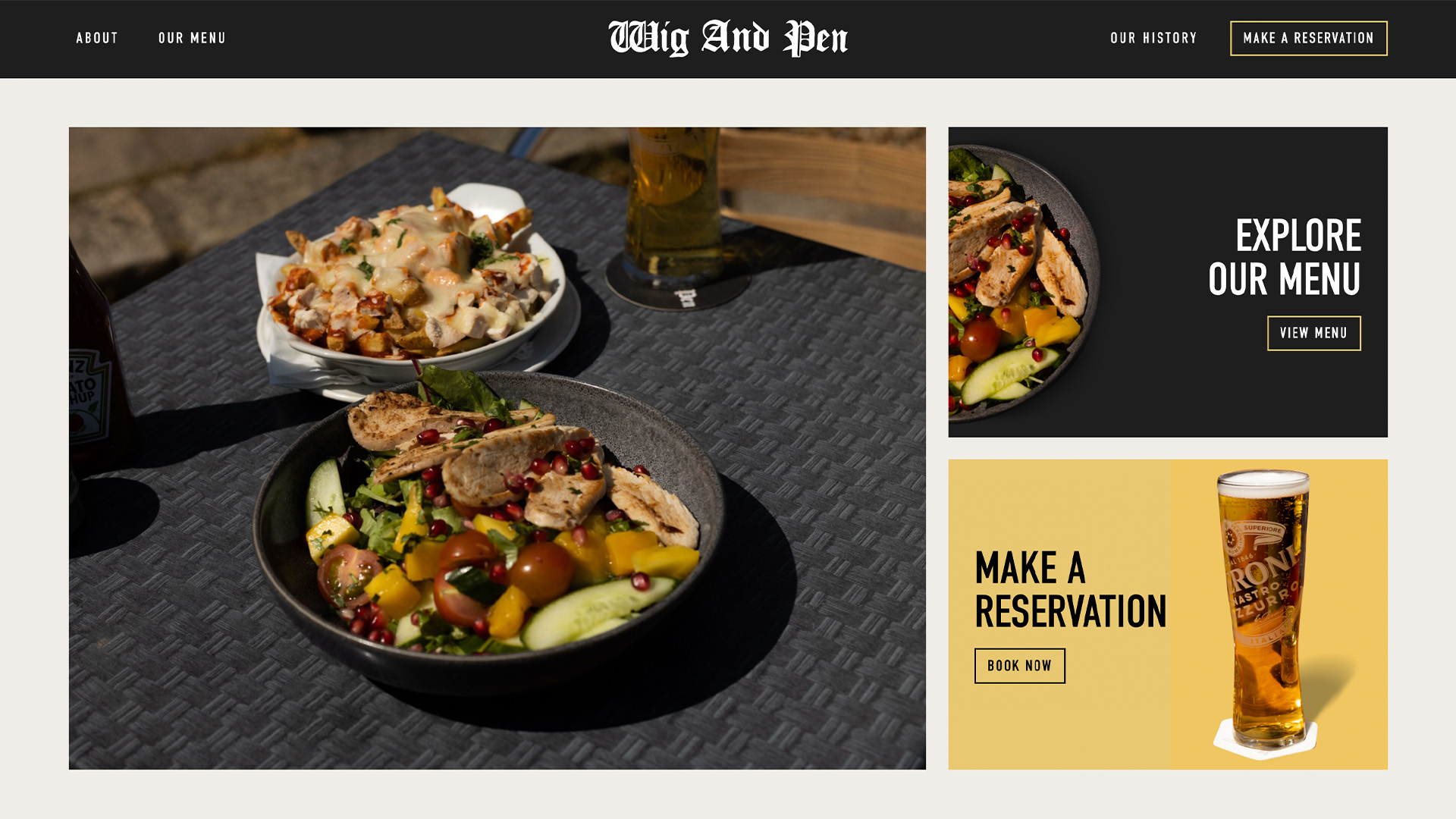
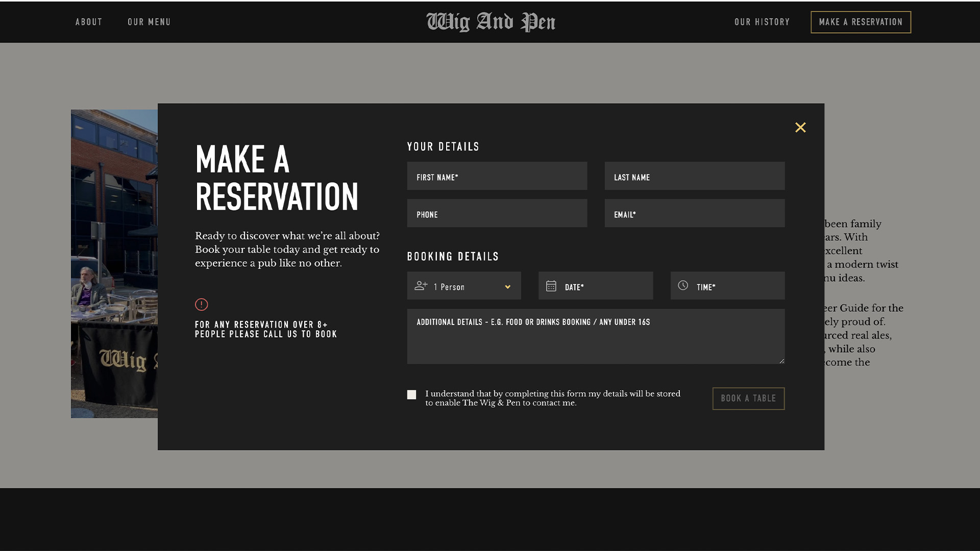
The main priority for us was to create a new website that reflected their lasting place on the local hospitality scene. This was to include a booking form, to connect with a younger market which would in turn, lift the pressure from the team by streamlining their admin processes.
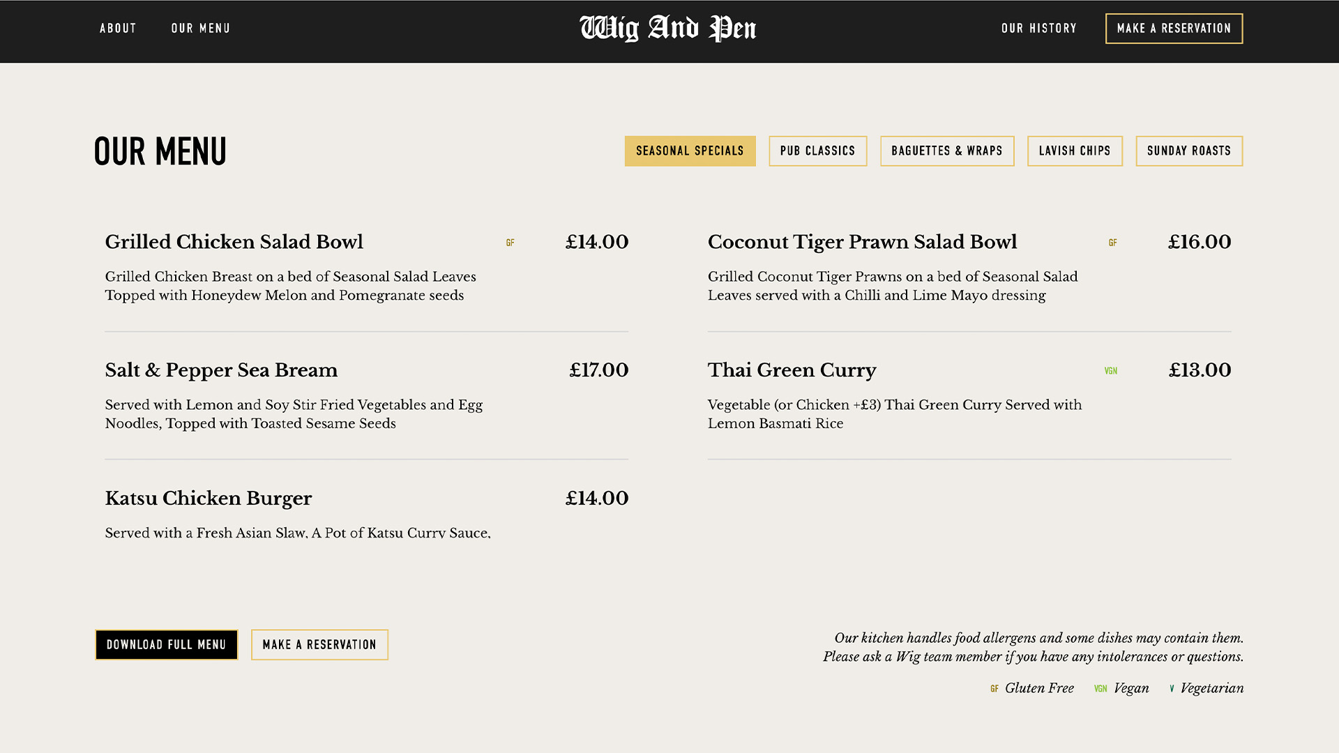
We also wanted to showcase their new menu, which still focuses on quality English food, but introduces a Pan-Asian twist, further cementing the pub’s values of traditional vs a modern approach.
What did we do?
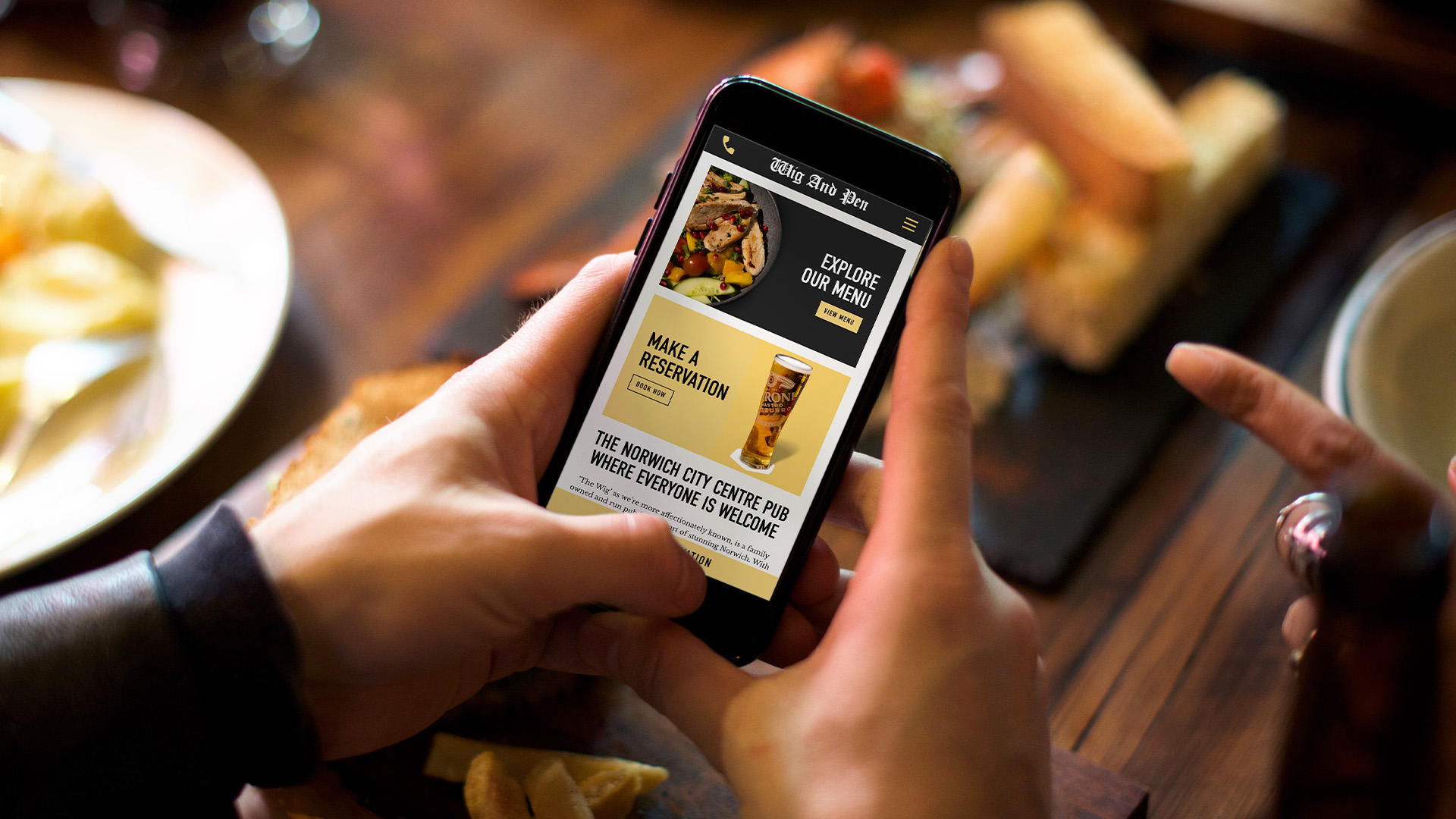
Keeping things simple, and to make sure that future updates were easy to handle for the in-house team, we created a single page website using WordPress as a foundation.
To allow easy navigation around the content, the information across the site was split into 5 main parts: an introduction, about, menu, history and reservations. Buttons for each of these were added into the header menu, taking the user straight to the relevant sections on the page upon clicking.
A sticky header follows the user’s journey, meaning that the menu is accessible no matter where you have scrolled to on the page.
Designer Jordan certainly got the memo too, utilising a condensed sans serif typeface (Din), alongside a traditional serif font. Taking inspiration from the building’s heritage and existing signage, a colour palette was worked up to feature gold and black.
Upon booking, to bring a little personality to the build, the user is thanked with a simple “cheers” and a pair of clinking glasses. Why not get booked in with the Wig to experience it for yourself.
We are delighted to hear that the majority of the Wig’s bookings are already coming via their form, which importantly is proving to be nice and easy to manage too!
Related Projects

Social Media Management