New branding and website taking centre stage
Not your ordinary draughtsman, not your ordinary website. Having specialised in the entertainment sector and working on projects for some of the biggest names in the industry, it was time to put John Venier’s website under the spotlight.
Drawing up plans for stage designs, 3D renders, and managing productions through to execution across the globe, Venier’s ambition certainly comes in abundance. This is the sort of energy we love to support and we grabbed the opportunity to help structure and elevate his digital presence.
THE GOAL
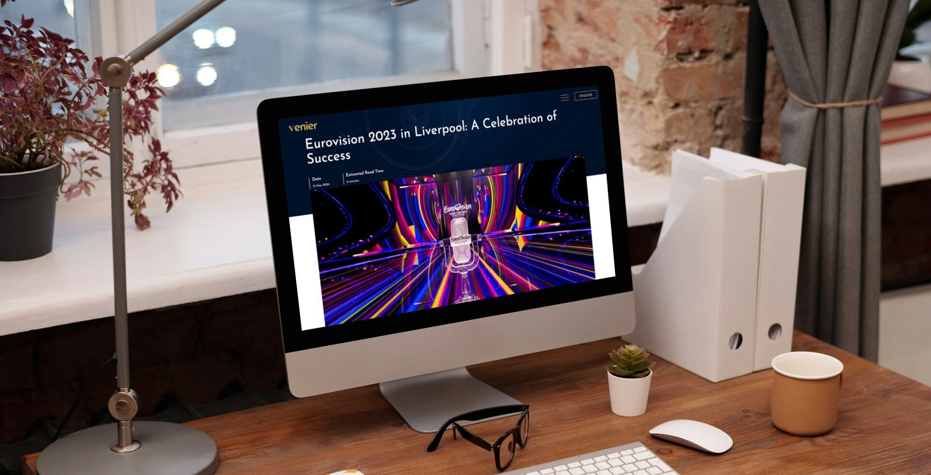
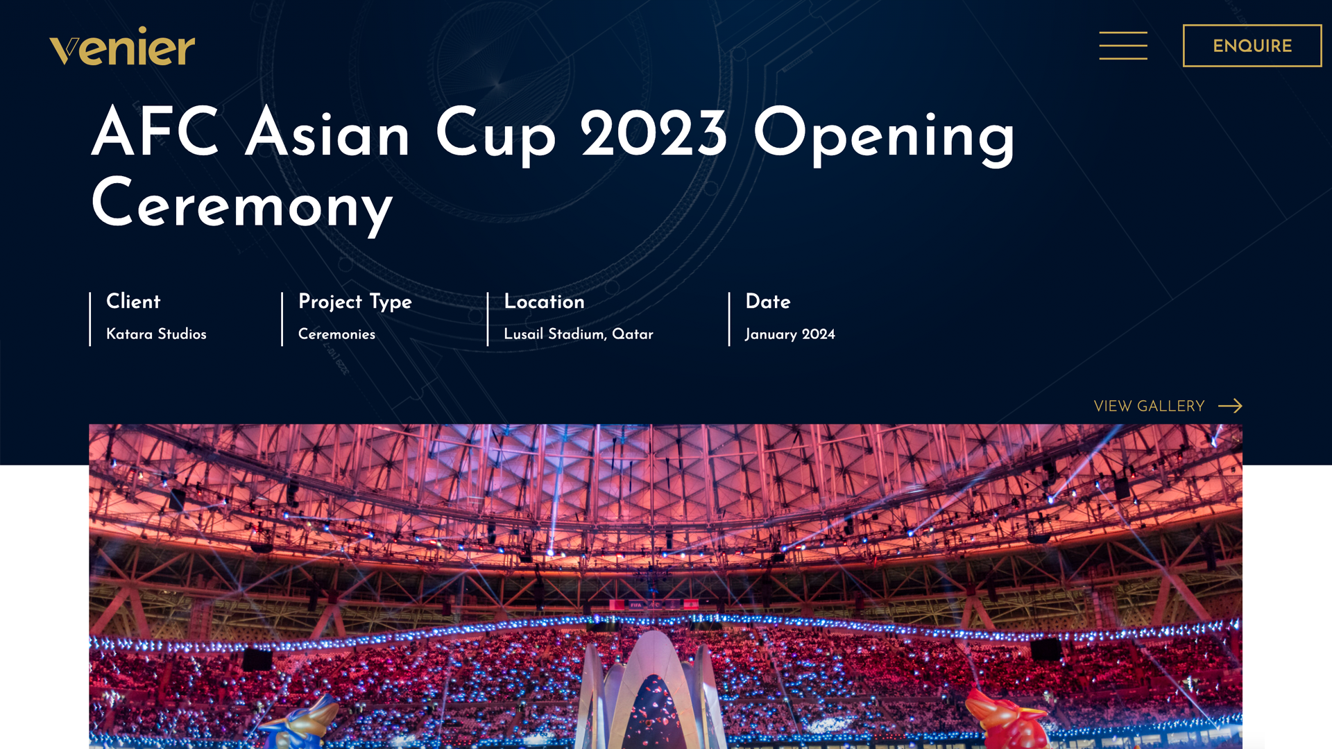
John wasn’t put on this earth to do things half-baked. From our very first conversation he had big ideas for his business and an admirable creative vision. It was pretty evident why he’s been selected to work on the likes of world-renowned stages like Eurovision, Asian FA cup ceremonies and the Commonwealth Games. (Yeah, he’s had a pretty incredible journey for such a young businessman.)
After working on such prestigious projects and with the calibre of John’s clientele propelling him into a more established chapter of his career, he needed a well-branded website that was on par.
WHAT WE DID
In true visionary style, we went big and started with a complete name change. Previously JV Draughting, John felt that the name limited the company when considering his multifaceted skill set and the possibility of scaling up. But, equally, we didn’t want to deviate from his origin.
A branding workshop later, we settled on John’s last name, Venier. It’s unique, pays homage to John no matter how big his studio grows, and has a rather elegant je ne sais quoi. It just works, you know.
When building upon the Venier brand we chose a clean and geometric font. Geometric fonts often feel structural or even architectural, if we may be so bold. It keeps things classy, whilst nodding to John’s profession as a draughtsman, which always starts with technical and sometimes mathematical drawings. Our designer Stephen created a bespoke ‘V’ icon, derived from the main logo, where the V itself has been split. One side is an outline representing the technical drawings themselves, and the other is solid to reflect a complete project, a subtle representation of John’s drafting process.
And the website? The key here was to let the images really sing and do the talking. We placed the case studies carousel centre stage. The choice of colours was a step outside of our usual go-to, we used a deep royal blue as the backdrop with gold accents throughout.
It’s rare we would opt for dark blocks of colour on a web build, but working predominantly in the entertainment sector, it made total sense for John. The dark background colour acts as a stage whilst the content steps into the role of the leading character under the spotlight.
THE BUILD
When building the site, it was important we took an animated approach. The devil’s really in the details on this one. Our developer, Rebecca, discusses some of the flashier nuances that really brought this design to life.
“The favicon changing from navy to gold based on the user’s system preference was a really cool touch that demonstrates we’ve gone the extra mile to make the user’s experience as seamless and slick as possible.
I also added the animated gifs to the banner and testimonial section, which were previously static images of blueprints. This clearly displays the nature of John’s craft immediately upon visiting the site, which is really cool.
Even small things like allowing the images in the project page galleries to be their true aspect ratio instead of forcing them to all fit the same shape shows that the website was designed to showcase John’s work in the best light – the gallery was designed around the images rather than the images being restricted by the gallery.”
One epic new name.
One epic new logo.
One epic new website.
Millions of new opportunities.
John’s faith in us paired with his own keen eye for design, resulted in something really quite flash.


It really is looking amazing and has exceeded all my expectations of what I set out to achieve way back in November when we first started these discussions.
Related Projects

Don't know where to start?