We worked with Flour & Bean (FAB) to completely revamp their existing website. At the start of lockdown we offered our services to develop simple e-commerce sites for businesses looking to incorporate collection services to their business.
eCommerce is all you knead
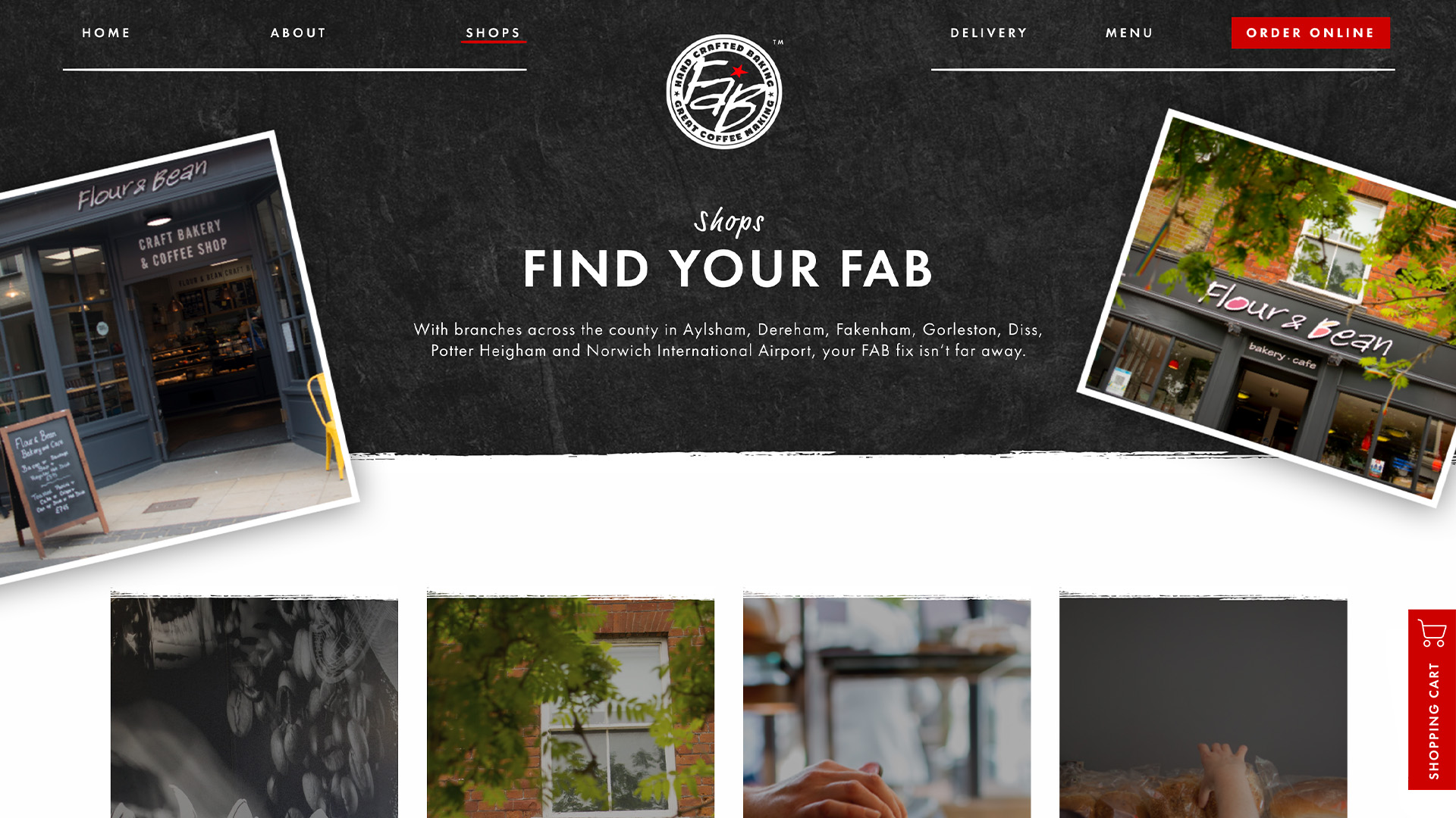
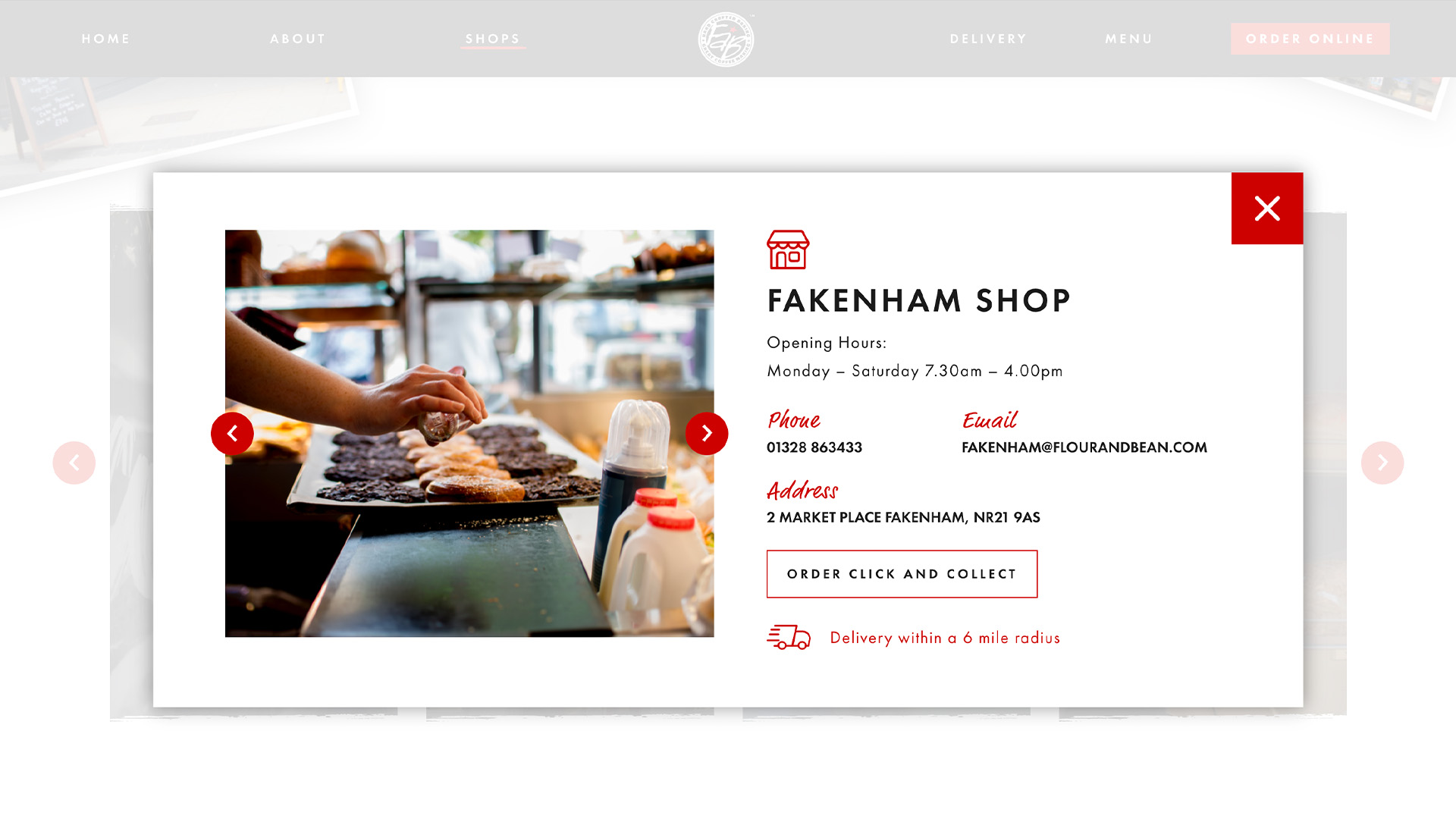
We worked with FAB on this to help them during lockdown, and have now had the chance to develop this site further! With multiple store locations around Norfolk, we needed to find a way to make it possible for users to easily access the store they were looking for, while still showcasing the driving aspect of the business, their food!
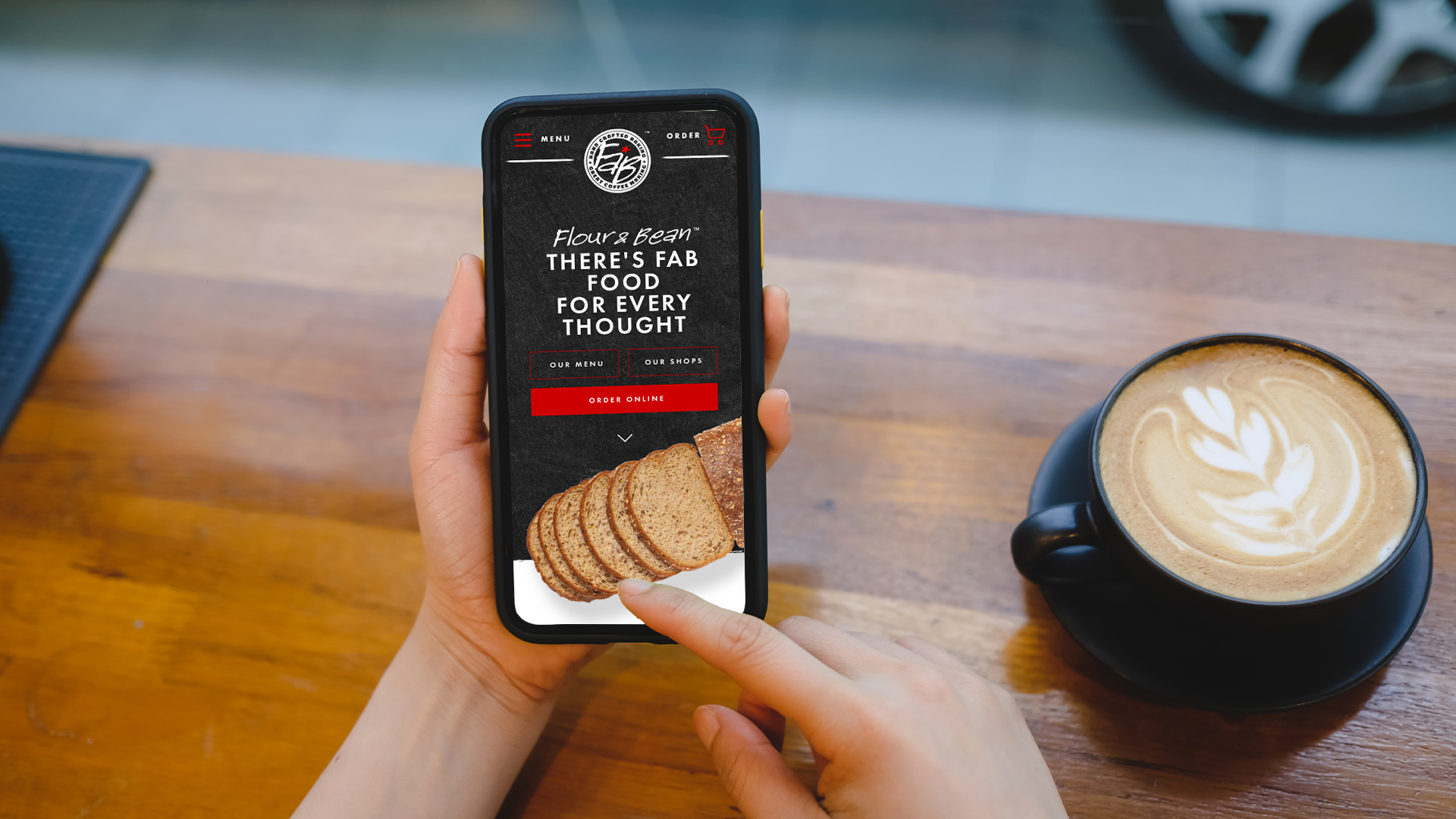
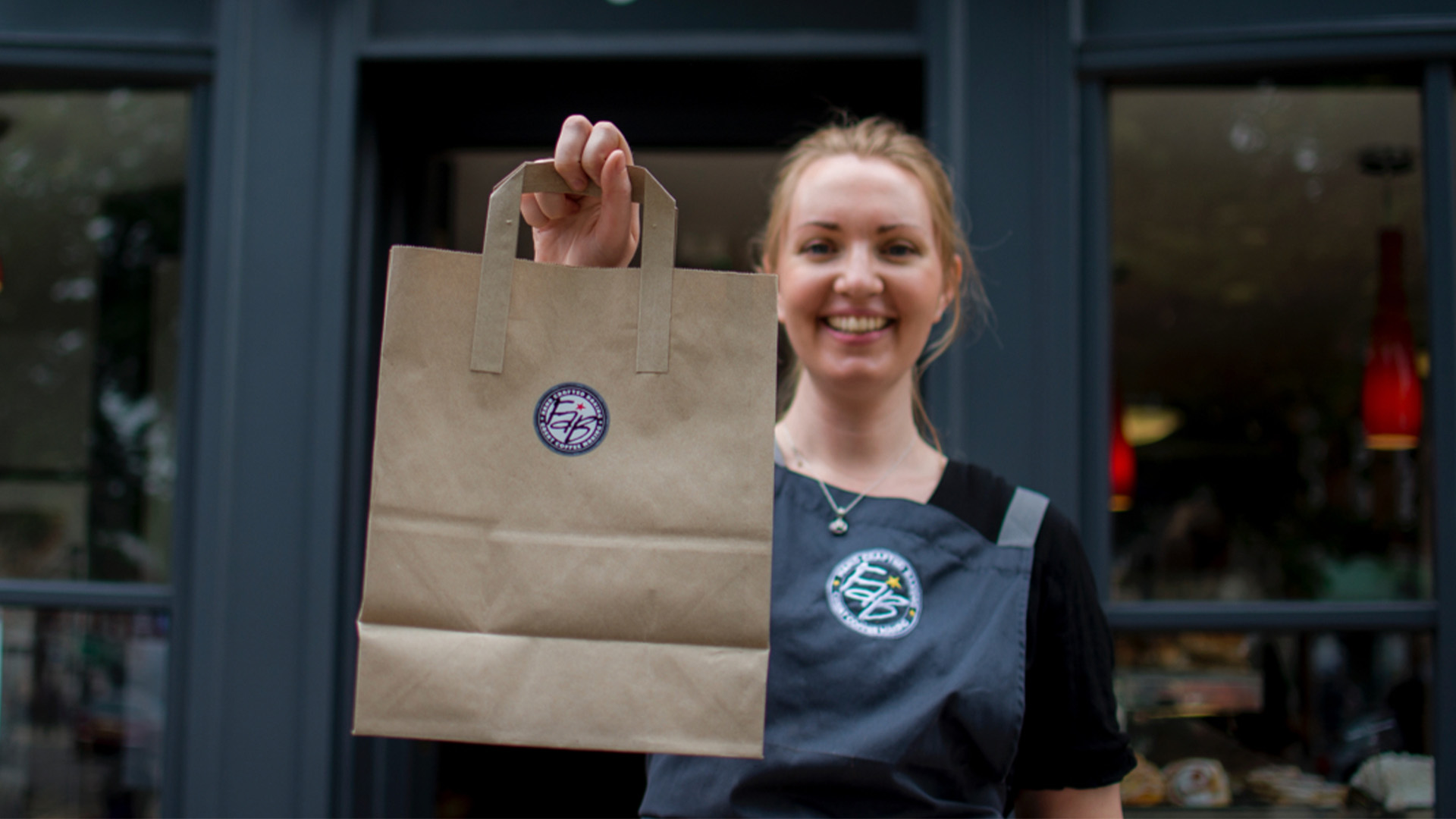
Flour & Bean is a family run Norfolk based bakery and coffee shop, they supply delicious, freshly baked treats and drinks. Before they came to us, the only way customers could experience their food was by visiting one of their cafe’s. They came to us for a refurbishment of their website, to freshen their branding, but also to incorporate a way for customers to pre-order their food through the website to a specific store.
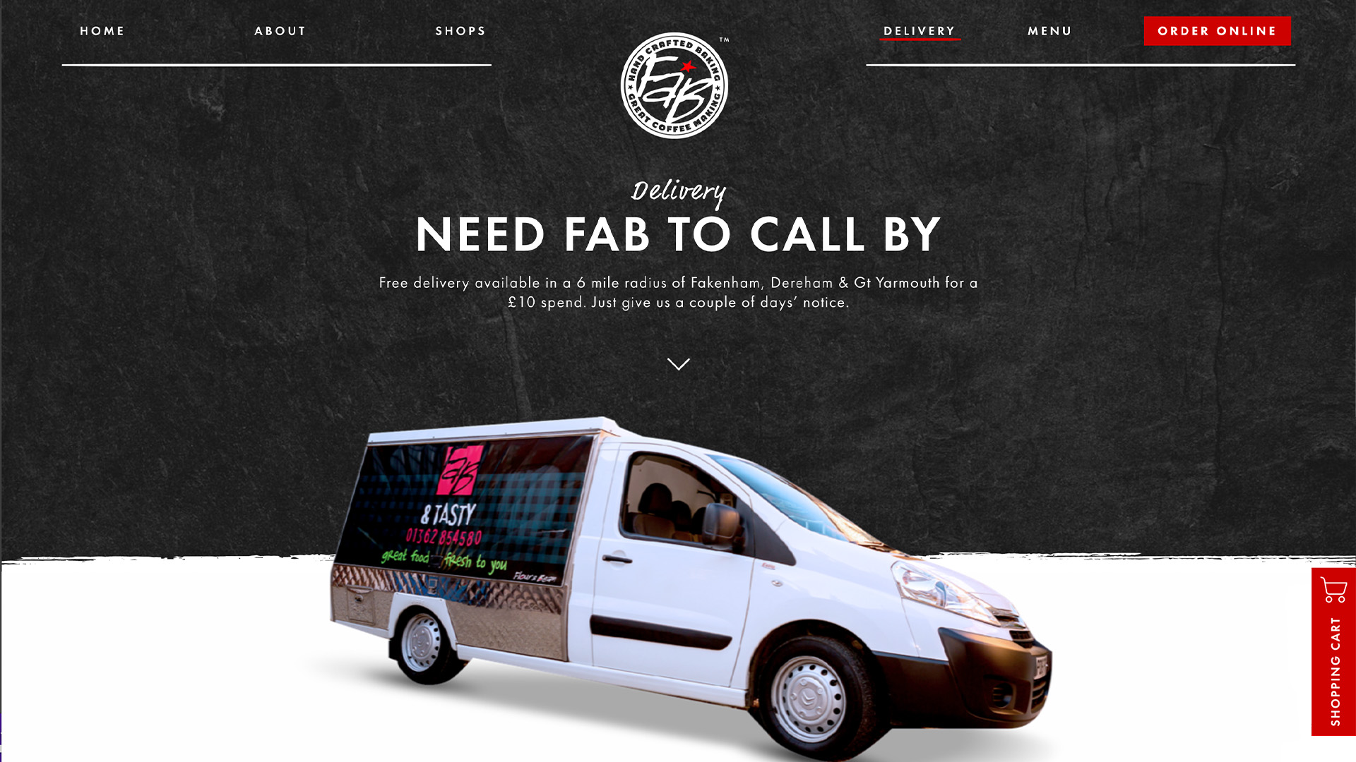
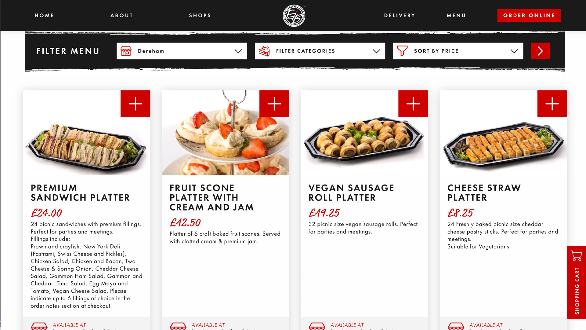
Our developers took this challenge in their stride, working hard to ensure that users would be directed to the available products for the store they chose. The development team programmed the website so that before users select what they would like to order, they are prompted to click on their selected store. This is a fundamental part of the website’s structure, ensuring that customers are ordering to the correct store to ensure that their food is ready and waiting for them. A delivery service has also been added, so that individuals or even businesses can select what they would like for next day delivery, for a lunchtime treat at work!
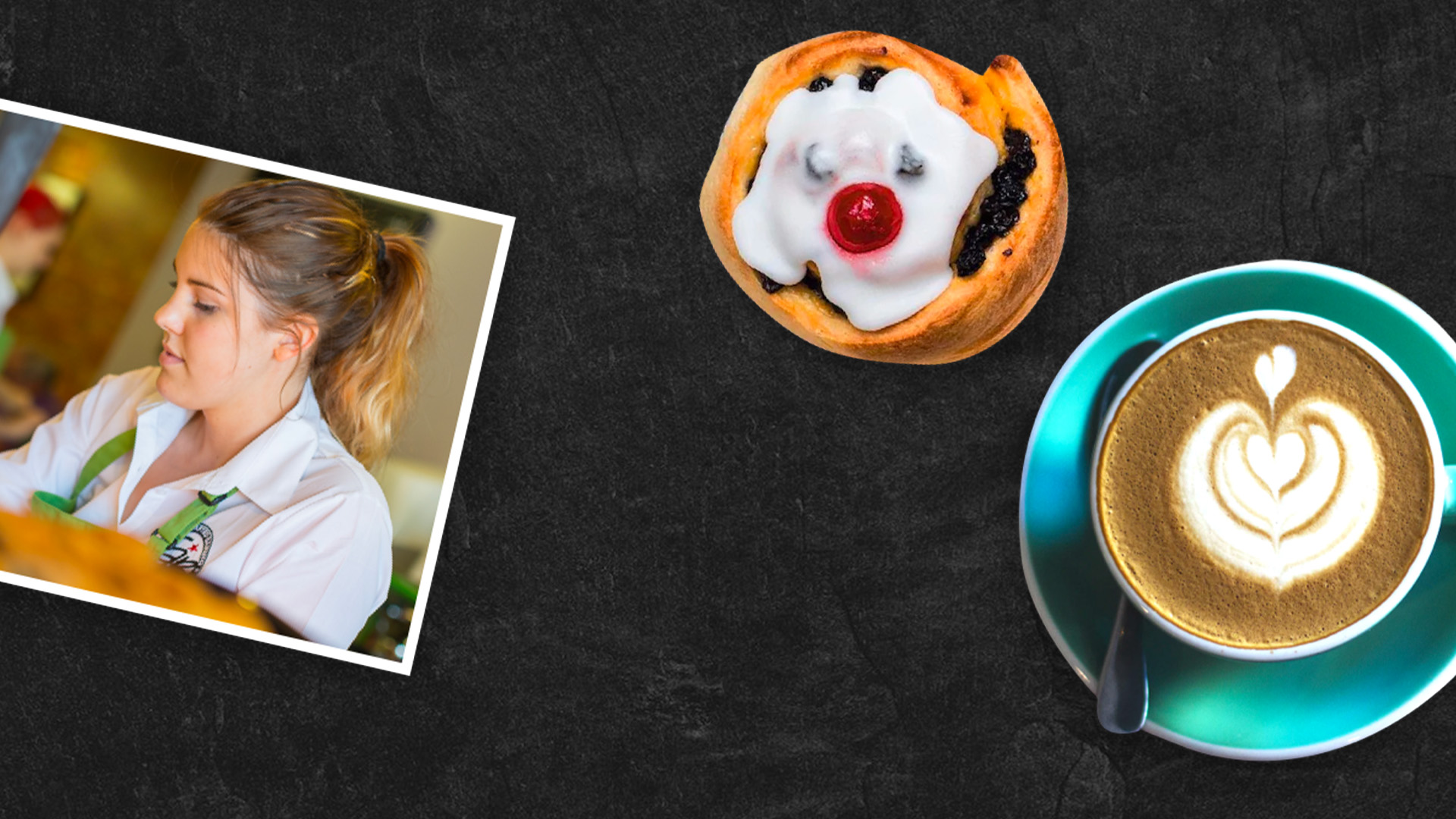
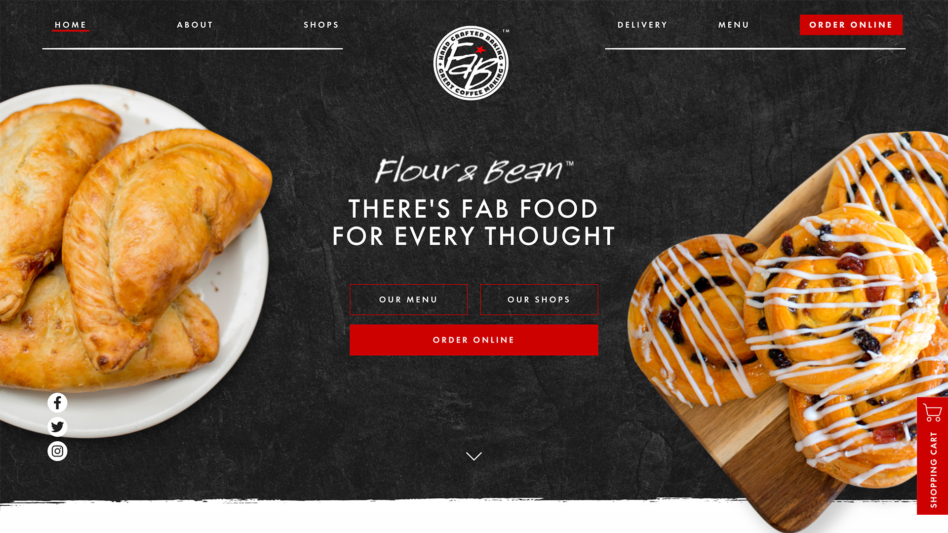
As FAB’s food is their key selling point, we had to ensure the photography used for the website expressed its true deliciousness. We went above and beyond to incorporate these photographs to the website in high quality, we know for a fact that our stomachs were growling while working on the site!
We also made sure their branding was constant throughout the website, through incorporating their brand colours to the main call to action points of the site. Our designer, Stephen, took the red from the logo and used this colour to draw attention to important details, such as contact points and the navigation bar. Having a clear colour for call to actions is fundamental for a simple user experience. Stephen was keen to make sure users could easily find their way to all of FAB’s tasty treats!
Related Projects

Don't know where to start?
Are you hungry for a new site? If you are looking for a revamp to your website, or a new website all together, our team is on hand to help you!




Social Media Management