As many of you are already aware, we moved studios this year, and whilst the benefits of a bigger studio and more than one fridge are appreciated by the team, one of the best things to come from the move was our introduction to Core Technology Projects.
The Brief
Core Technology provides high quality security systems, automated living solutions and commercial technology installations. They installed our security systems and our integrated screens for presentations. As a like minded business who wants to provide exceptional services and who see the sky as the limit, we immediately clicked and created one of our best websites yet, if we do say so ourselves.
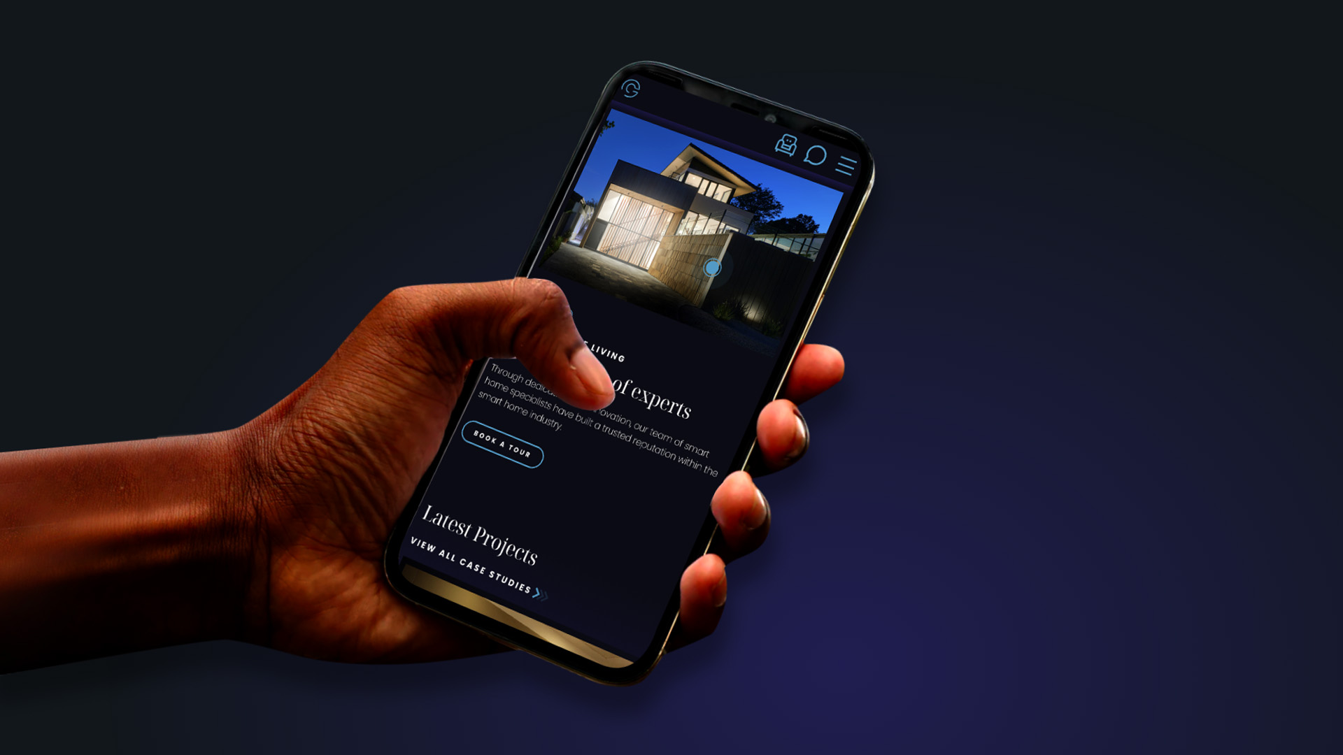
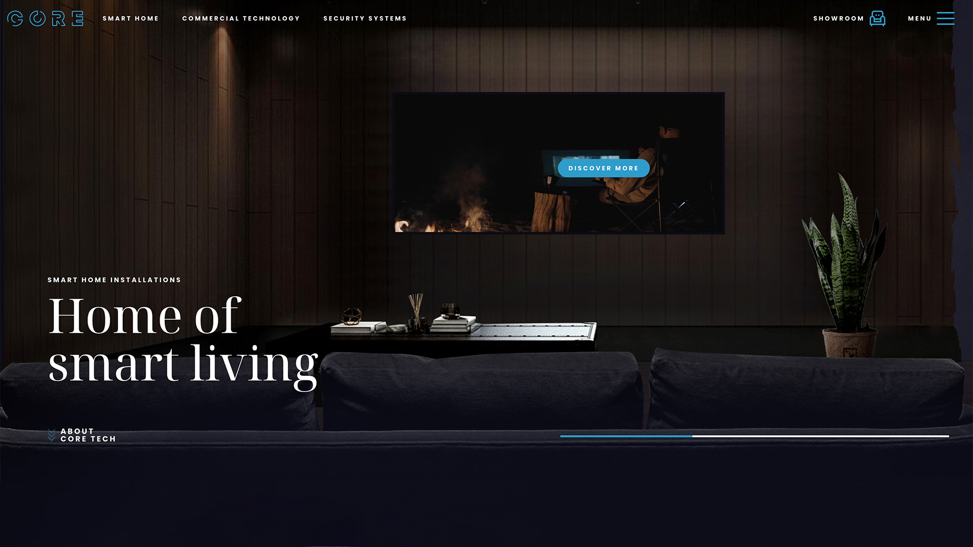
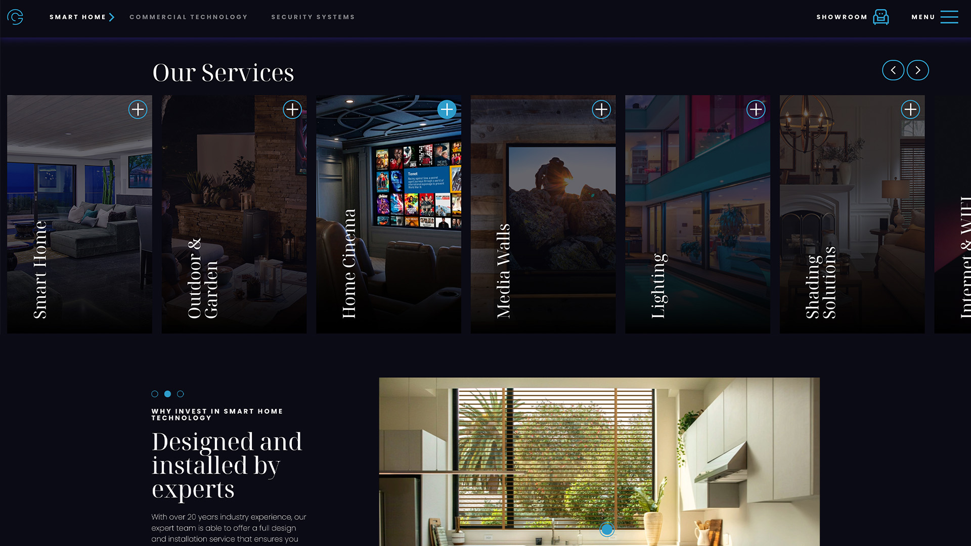
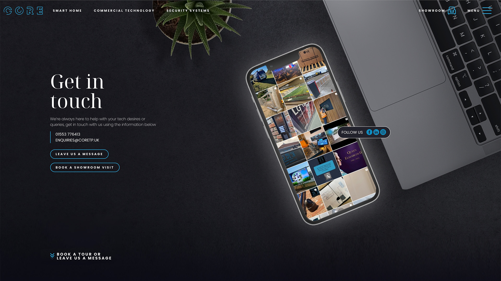
Our brief was that the website needed to not only have their portfolio on, but it needed to be a portfolio in itself. With interactive elements, smooth transitions and little flourishes throughout, the site is an immersive experience which draws you in as you begin to experience the lifestyle Core can offer. One of the main ways to convert is to book a showroom visit (which we would thoroughly recommend), as it truly showcases the craftsmanship behind Core’s offering. We ensured that there is a link to book a showroom visit in the sticky header so wherever the user is on the site, they can get to the booking form once they’re inspired.
Production & Improving User Experience
The interactive cursor has been requested a few times since we introduced our little guy, which is great because it offers lots of scope for creativity. Core Tech actually boasts three cursor states, one for clickable text, an eye for the interactive elements and a little remote for general browsing. This can actually be beneficial in guiding the user through the site, in addition to hover states and consistent call to action colours.
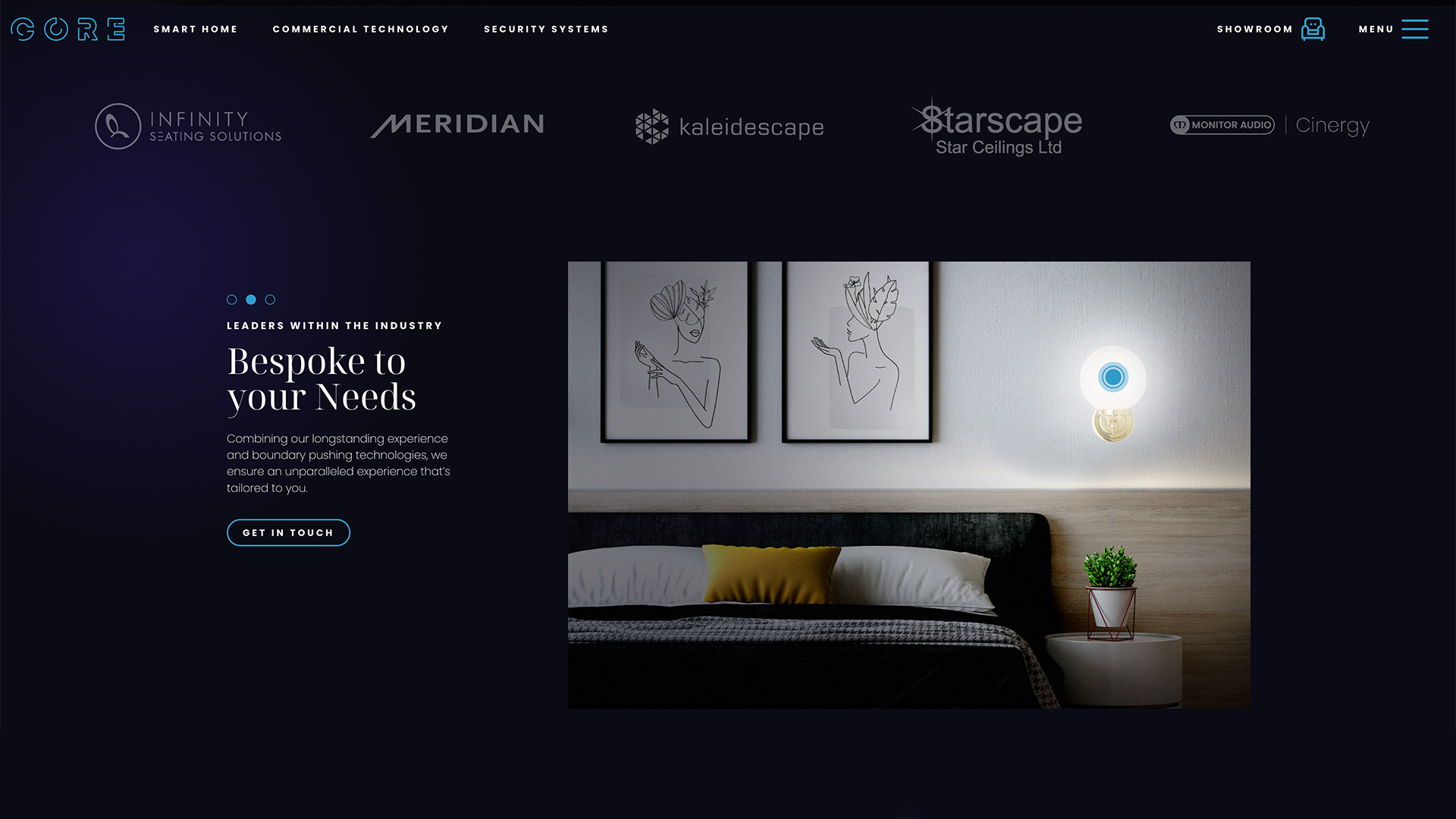
As the site is quite indulgent, we needed to ensure that it was balanced in terms of how much written content is displayed. The perfect balance is difficult to achieve, because too little copy and you run the risk of poor SEO, too much and it overwhelms the user and overshadows the creative designs. We introduced carousels for the text and modals which until clicked on, hide text. This results in the emphasis being on the vital call to actions and creative elements, but still offers the user enough information to learn about Core’s offering.
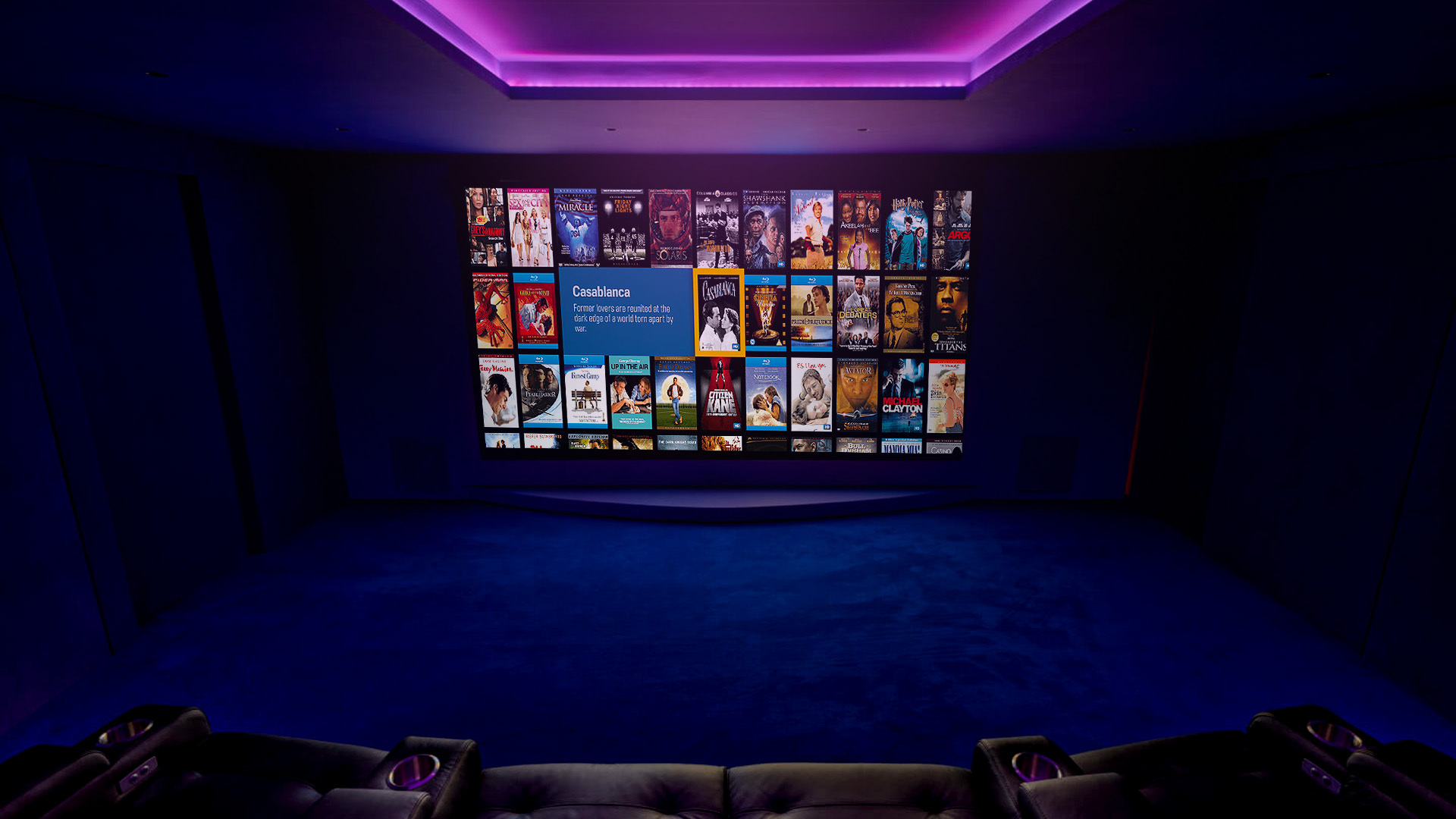
The transitions from the scrolling banner when you click on the TVs mimic the integrated systems Core offer. The smoothness of the transitions between the homepage and the service pages which then play a video, mirrors the quality of service you will receive from the team at Core.
To improve the user experience, we reduced the amount of initial services offered, and grouped them into three main offerings: Smart Home, Commercial Technology, Commercial Technology and Security Systems. This way the user isn’t overwhelmed by an offering of too many routes to go through.
So, what’s next for Core?
Core signed up for Digital Marketing before we even launched the new site, all our websites are built with SEO in mind, and the copywriting was provided by our talented Digital Marketer Erin, who is the account handler for Core going forward. We’re really excited about continuing our journey with Core, we really weren’t ready to say goodbye. Definitely watch this space, as they will be rocketing through the rankings in the coming months.
Be sure to check out their new website and let us know what you think. We have loved working with Core Technology and it has been one of our proudest projects yet.
“Thank you and all the team for your excellent work, it looks sensational!!!”
“Awesome, Looks great. Please pass on my thanks again to the whole team who have pulled it out the bag far beyond what we were expecting.”
Related Projects

Don't know where to start?


Social Media Management