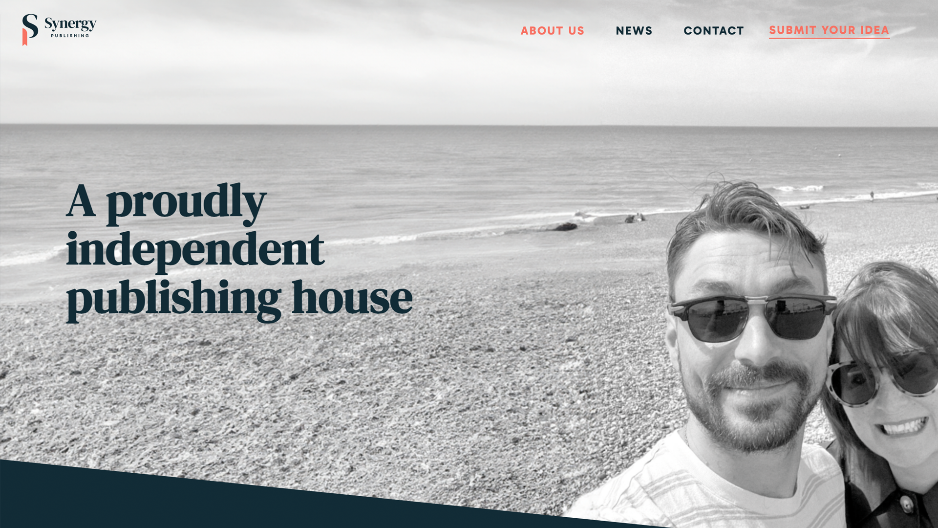
Synergy is a vibrant new name in the publishing world, but that’s not to say that mother and son team Suzi Wooldridge and Cameron Toman are without experience in the industry.
Having headed up a multinational publishing enterprise, Suzi wanted to create a new legacy to share with her son Cameron, a journalism graduate based in London.
Synergy is set to be a change maker in the industry, combining a foundation of knowledge and expertise with a huge passion to grow. Happily, they are the perfect fit for us.

The goals
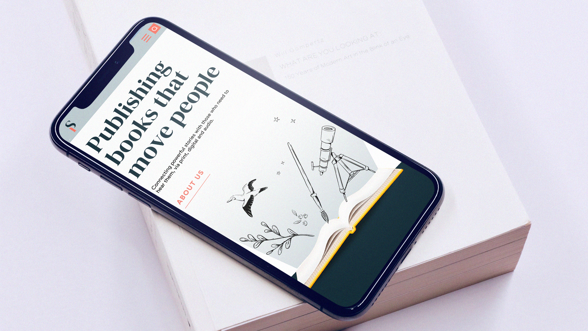
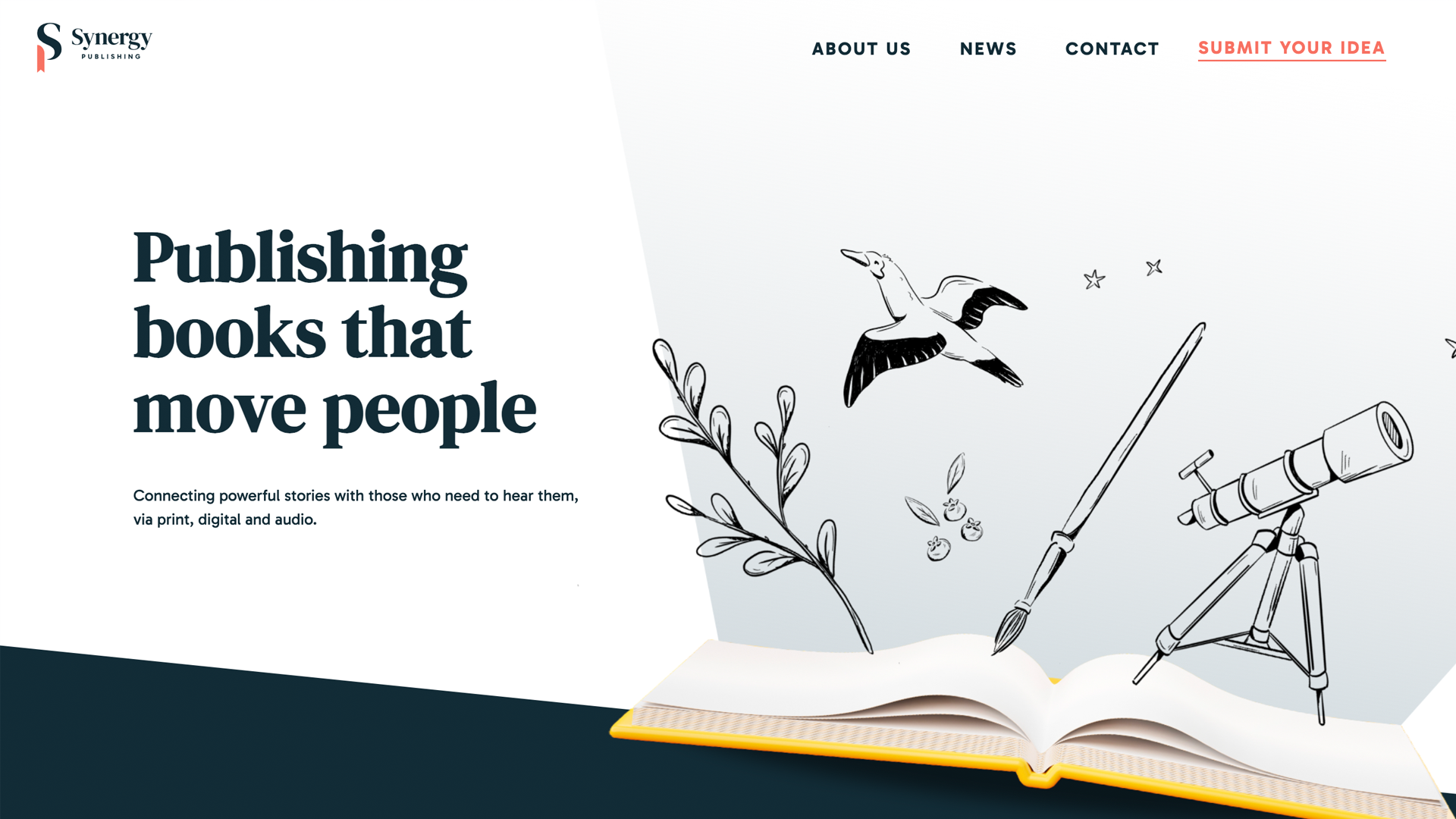
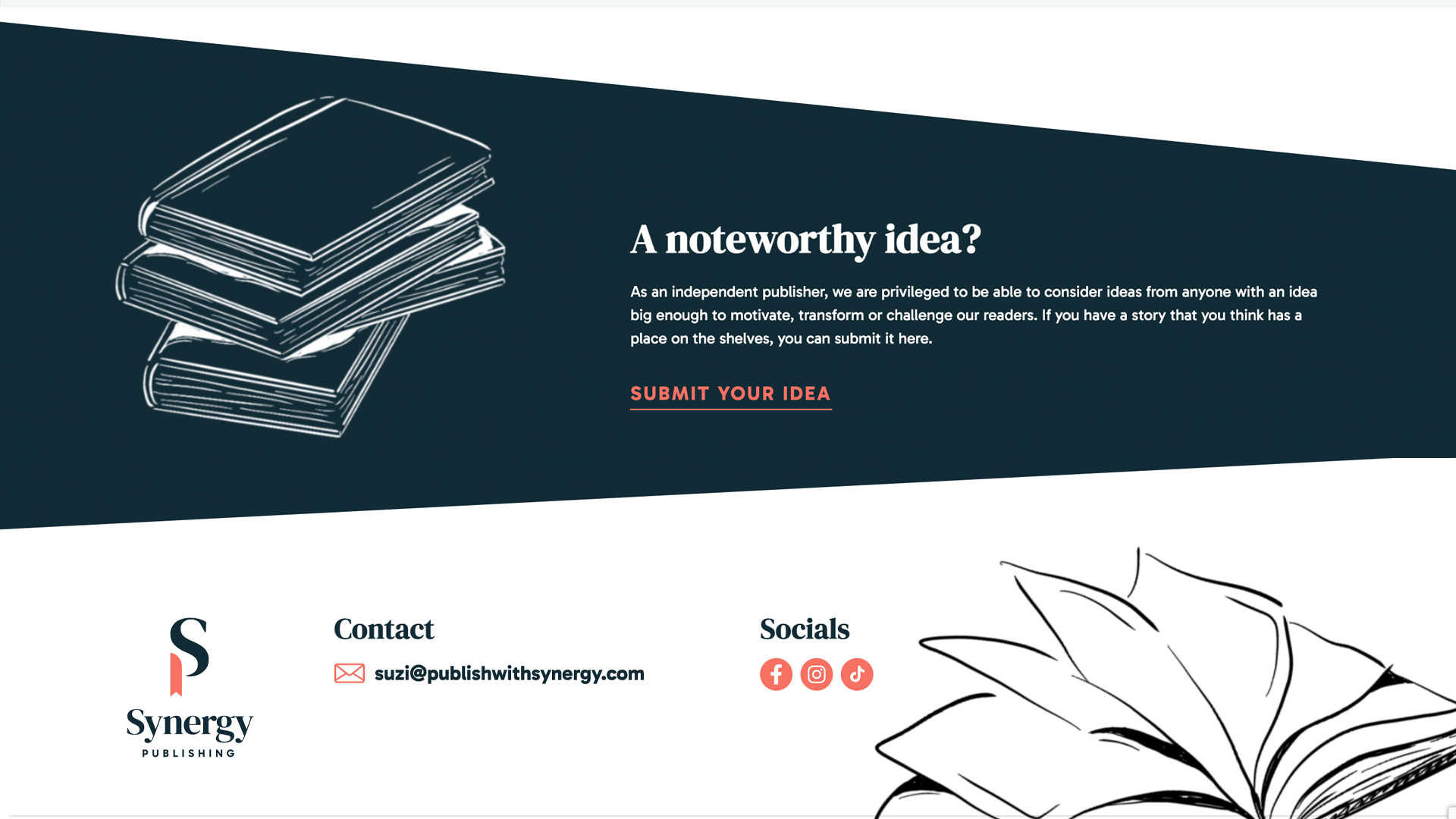
The team wants to support genuinely inspiring people to get their stories heard (sound familiar), they are publishing authors that have experiences, advice and skills that the world needs to hear, those tales that you will want to learn from and share. Focussed on modern-day wellness and open-minded attitudes, Synergy came to us needing a brand and a website that could communicate just that.
What we did
The first step was to spend some time around the table together, to ensure that we fully understood the vision, and growth goals of Synergy as a whole.
Then, it was time to get creative. We created a few variations of a logo, and colour palettes which we felt would hit the original brief. The next step was for Suzi and Cameron to narrow these options down to just one favourite (naturally this can be tricky when all the options are so good. Teehee).
Using their new logo of choice to inspire the colours and style, and working to the axis of their main conversion goals, we then designed the website templates and got the project into its final phase – the build.
Stop. Wait a minute. It was then that both Cameron and Suzi took a moment to pause, reflect and re-consider their initial decision on their branding and logo. Once seeing the site in build, they changed tact and went with one of our initial branding concepts, a logo which incorporates a bookmark within an ‘S’ monogram. Easily identifiable when featured on social channels and book spines alike.
Ah no, what an absolute nightm-… Only joking. We were ahead of schedule, and we mean it when we say that our code is bespoke. So, we got the branding updated, changed the colour palette, and carried on. As we said, it can be tricky when all the options are so good. (teehee, again) and the final choice happened to be our favourite in any case.
The final piece that was whirring in the background in tandem with the build stage was, of course, drafting the copy for the site. Nicole Howes, director, copywriter, mizz with the rizz (to be clear, she didn’t write that bit), knew it needed to fit with the overall brand that Cameron, Suzi and the Nu Image team had worked so hard to establish. It needed to embody the very essence of what Synergy does and show why they differ from a stuffy ol’ publishing house of time gone by whilst still communicating the team’s knowledge of the industry – after all, no one wants to put their trusted manuscript in the hands of a novice and never see it hit the shelves. Nicole set to interviewing Suzi about the business, delving into their “Why” before crafting the copy that you see on the page today.
But enough from us… what did you enjoy about the project, Nic? “I adored writing the web copy for Synergy. It’s always special to feel like you are a part of someone else’s story, and it is a privilege to translate their own view of the business into something tangible as the design, build and copy all come together at the end of the project. Suzi is super passionate about working alongside her son to bring this new business to life, and I know our team are excited to help them reach their potential.”
The build
It’s true that we get a buzz from the different challenges each build brings us. Sam, the developer behind the mechanics of this project, said, “I loved working on the Synergy website because it let me bring creative design flourishes to the forefront. Crafting a sleek, responsive layout was a joy, and I enjoyed experimenting with innovative visual elements. The project truly came to life, resulting in an engaging and visually stunning user experience.”
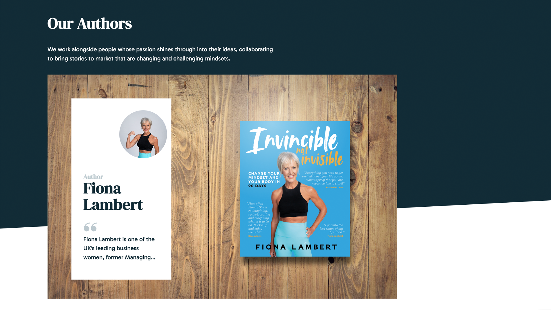
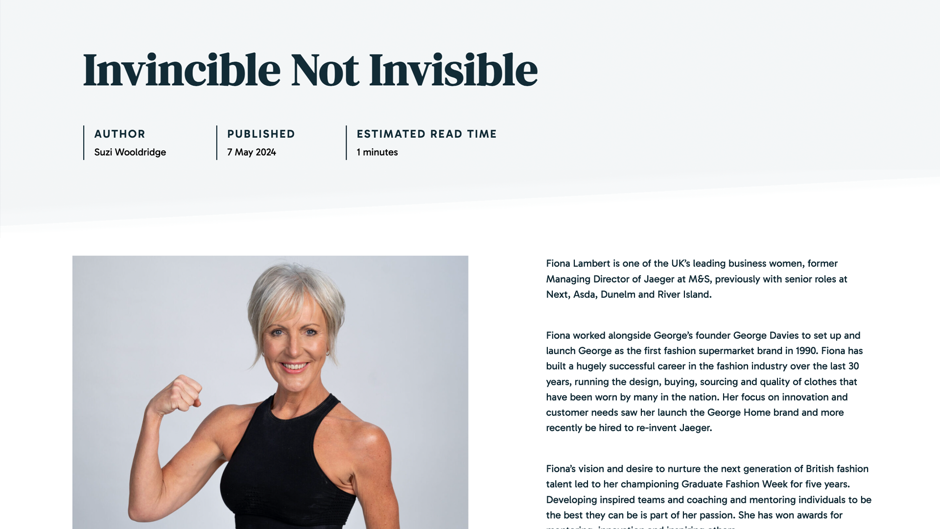
Since the launch, they have already secured three additional authors, with many more in the pipeline. We are really excited to see where their own story will end up.
Suzi left us an incredibly kind and glowing review, so we’ll tie it up with that final note.
“A fantastic experience with this professional and friendly team of creatives at Nu Image.
From the very first call, we knew we had made the right decision. Nu Image gave invaluable advice and direction, and we now have a superb new company image together with a modern and up to date new website. Thank you guys for all of your help, we look forward to working with you over the coming years!”
A fantastic experience with this professional and friendly team of creatives at Nu Image. From the very first call, we knew we had made the right decision. Nu Image gave invaluable advice and direction, and we now have a superb new company image together with a modern and up to date new website. Thank you guys for all of your help, we look forward to working with you over the coming years!
Related Projects

Rebrands can be daunting
There can be many hairpin turns in the road, many eyes and big audiences to impress, but with our guidance, you’ve got nothing to worry about. Have the confidence to just do it and do it differently to everyone else. You ready? Let’s go.
Social Media Management