Why is a call to action an important addition to your website?
Picture the scene.
Your business has a brilliant website, it is fully optimised to be mobile device friendly and it matches your brand guidelines.
Thanks to organic SEO or Pay Per Click advertising, you are well aware that by searching for your services, your website appears above your competitors on Google.
So why, frustratingly, are your visitors to your website not hanging around or converting into sales?
It may be that you have overlooked an important sales technique, your call to action.
What is a Call To Action?
A call to action is a statement of content that is designed to invoke an immediate response or action from the reader. In the case of a website call to action, it is likely to be a ‘buy now’ or ‘call now’ button along with supporting copy.
5 things to consider when creating a Call To Action;
Relevance
Ensure your call to action is relevant to your audience. If you are selling a product, a “buy now” or “buy here” button may be the best approach, if your product requires a more involved quotation process you will need to use a ‘call us’ request.
Positioning
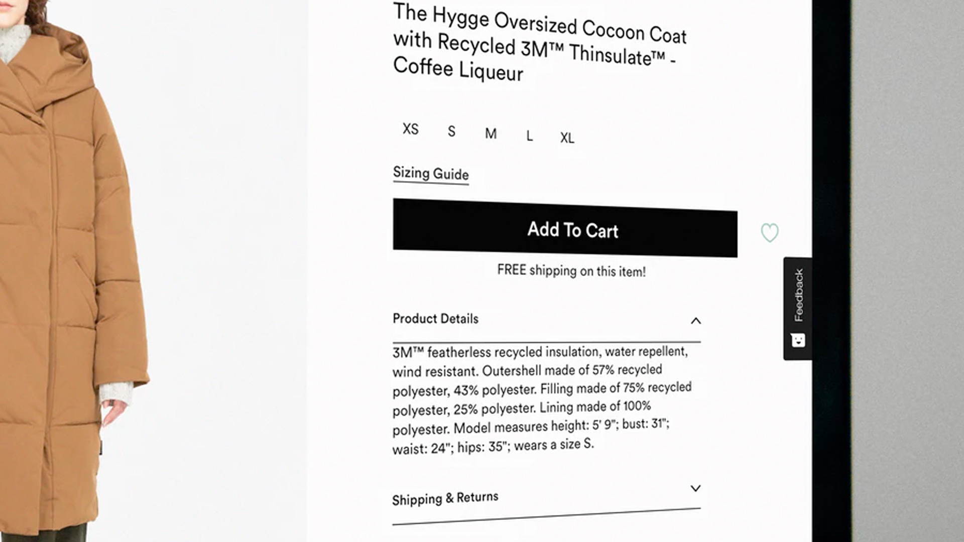
Your website copy will hopefully be peppered with call to actions, but we find a successful way to lift the demand from the page is to have a separate clickable button on your web pages. Sometimes it would be wise to include more than one of these on your home page, often with different functions.
Place a call to action on your home page, near to the top and in the centre, like we have on our own website – it is easy for users to locate, even if they are visiting briefly. Alternatively, choose a sticky tab, which remains in view wherever your customers are browsing, such as a ‘get a quote’ button. You can see an example of this on the website of local flexographic printers, Polyprint.
User Friendly means quick and simple
A ‘call us’ request or ‘buy it now’ call to action, needs to make the users life simpler. Contact us should divert the user to your online contact form, call us on a mobile web page should of course allow the call to start the moment the button is clicked and any ‘sign up’ actions should only require minimal data input to stand the best chance of data collection.
Style
If you are using a call to action button, it should look clickable and be in keeping with your branding, whilst standing out in a prominent fashion.
Copy
Lastly, and likely most importantly, choose the language you use carefully. Use persuasive language and imperative verbs (bossy words!) to engage with your customers and promote the action. Words such as; buy now, sign up, book here, find out more, contact us today work really well and are short and snappy enough to be used within your web button. If you are unsure how to include call to actions within your content, whilst keeping your copy engaging you should consider hiring a professional copywriter for the job.
If you require help adding content to your existing website to increase your conversion rates, or you require a “call to action” button to help increase your conversion rate, call us today on 01603 859007 (see what we did there?)

Social Media Management