Unless you’ve been living under a rock for the past week, you’ll no doubt have noticed that social media has been swept up in the ’10-year challenge’. Asking users to compare images of themselves taken a decade apart, the viral challenge has, unsurprisingly, recalled some styles and trends that we’d prefer to forget.
Indeed, whilst it’s been a joy to see our friends and celebrities ‘glow up’, it’s not so great being reminded of orange spray tans, knee-high gladiator sandals, and enormous belts.
Between laughing and cringing, our team got to thinking: what would it look like if the web was to participate in the 10-year challenge? In other words, if we dug out a photo album of the internet from back in 2008, what dodgy haircut would we find digital marketing sporting? What fashion crimes would logo design be guilty of, and what embarrassing poses would web design be pulling?
To answer these questions, we’ve taken a brief trip back in time to the year that saw Myspace dominating social media, Barack Obama winning his first election, and Beyoncé imploring eligible bachelors to put a ring on it.
Digital marketing:
2008 was in many ways the year that big business woke up to the value of SEO. Indeed, annual conferences began emerging that brought together experts keen to share their insights. Google also launched it’s ‘SEO Starter Guide’ to provide practical advice for individuals and companies keen to get ahead.
2008 was also the year that Seth Godin, esteemed dot com businessman, famously declared that ‘content marketing is all the marketing that’s left’.
Such a prediction was bang on the money, with SEOs now dedicating a great deal of time and resource into this type of marketing for the purposes of link building and brand recognition.
Web design:
A cursory glance back at design publications in 2008 reveals that it was Apple’s site that was the most hotly discussed. Praised for its striking simplicity, developers and designers agreed that it was the ‘best designed website in the world’.
However, a closer look at the site as it was in 2008 shows that it was dense with copy. We’re talking college essay amounts of copy. Safe to say this design had our team wincing when looking at it in the studio.
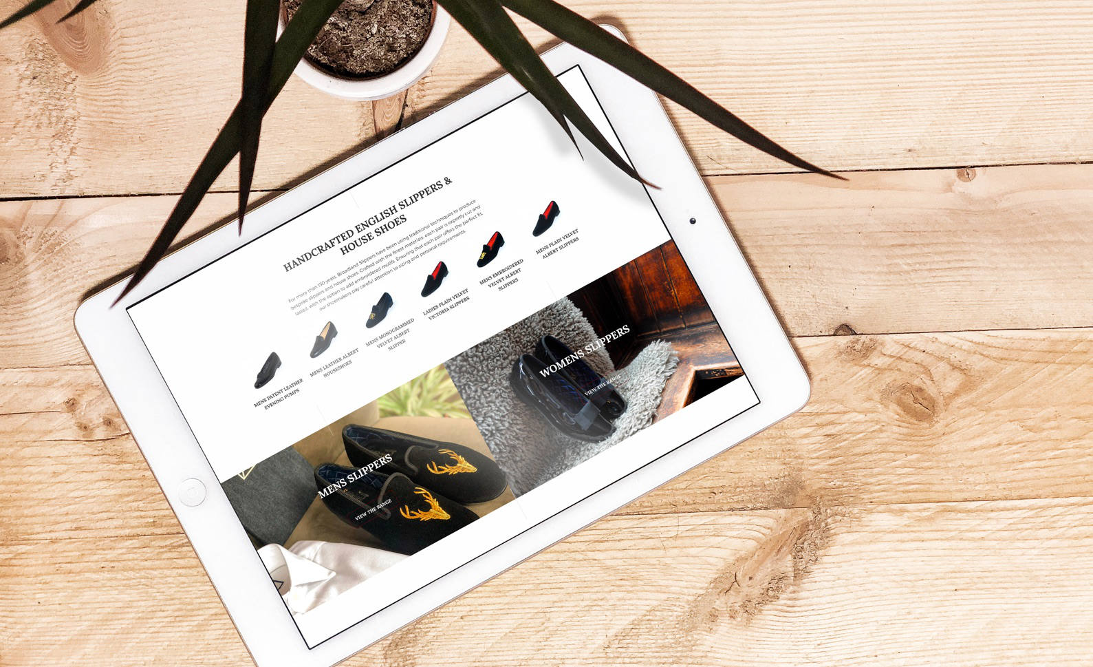
We recognised the massive change in web design ourselves when we recently completed a new site for Broadland Slippers. A local business specialising in bespoke footwear, their previous site wasn’t responsive and didn’t have the perfect calls to action that we focus on now.
Faster loading times have also meant that we were able to utilise higher quality images across the site and make the user experience altogether more rewarding.
Generally speaking, web design has adopted a ‘less is more’ approach, with intuitive calls to action and less copy making websites far more enjoyable to use.
Logo design:
2008 was the year that graphic designers truly ran away with bright colours. From sunshine yellows to hot pinks, the web was alive with technicolour.
It was also a time that was saturated in green. A shorthand for environmental friendliness, companies embraced this colour scheme in their millions, making many sites and directories look like digital jungles.
Thankfully, such strategies have been consigned to the 000s and design has now moved on to cleaner and more minimal trends.
Ultimately, the way the web looked and behaved in 2008 is drastically different to the way it looks and behaves now. Just like we all collectively jumped out of baggy jeans and into skinny ones, the web has changed its landscape to make it a more useful place for both users and businesses.
At Nu Image, we’ll make sure that your site and its marketing remain up to date, keeping you on top of the competition and totally cringe-free. Feel free to get in touch with us at our digital marketing agency today to find out how we can work with you and tell your story as you go forward.

Social Media Management